Have you ever been browsing a website, and suddenly, a small window pops up on your screen? That’s a popup!
They’re used by websites to share special offers, ask if you’d like to sign up for newsletters, or even just give you a heads-up about something. While they have a reputation for being a bit annoying, there’s a lot more to popups than meets the eye.
In this blog, we’re going to dive into what is a popup, types of popup, why websites use them, and how they can actually be helpful despite sometimes catching us off guard.
Let’s dive in.
Create smart popups that are triggered based on visitor behavior using Retainful.
What is a Popup?
A popup is a small window that appears on a webpage, usually displaying an advertisement, a form for collecting email addresses, promoting an offer, or other interactive content.
Popups are used to grab the visitor’s attention for promotional purposes, to offer assistance (like chat support), or to provide important information or warnings.
Popup or pop-up? “Popup” is a noun referring to a small window that appears on a screen (e.g., website popups). “Pop-up” (hyphenated) is an adjective or noun describing something that pops up, like “pop-up store” or “pop-up notification.”
Why are Popups Important?
Though popups have a reputation for being intrusive and annoying, if used thoughtfully, they can act as a lead generation and conversion tool.
Here are more reasons why popups are important:
- Capturing attention
By appearing directly in the user’s line of sight, they make the content impossible to ignore. This makes them an excellent tool for communicating important messages, warnings, or offers. - Improving conversion rates
Popups can significantly increase conversion rates when they offer value to the visitor. Popups do this by turning passive website visitors into active participants and customers.
For instance, offering a discount, newsletter sign-up, or access to exclusive content in exchange for an email can entice visitors to take action.
This direct form of engagement is much more assertive than side banners or static calls to action (CTAs) embedded in webpage content, which can be easily overlooked. - Lead generation
Popups are best at capturing the user’s attention at strategic moments.
Using these to collect email addresses or contact information through popups allows you to build email marketing lists.
For example, popups triggered after a visitor has spent a significant amount of time on a site or has engaged with specific content can capitalize on the user’s interest, making the lead capture more relevant and timely. - Reduces bounce rates
Popups that are triggered based on user behavior, such as exit-intent popups, can help reduce bounce rates by offering users a reason to stay on the site longer or engage with the content on a deeper level.
For example, a popup that appears when a user attempts to leave the site might offer additional information or a special discount, encouraging them to reconsider their decision.
10 Types of Popups with Examples
10 types of popups are:
- Welcome popups
- Exit-intent popups
- Add-to-Cart Popups
- Sidebar Popups
- Full-Screen Popups
- Timed Popups
- Scroll-Triggered Popups
- Feedback Request Popups
- Countdown Timer Popups
- Gamified Popups
1. Welcome Popups
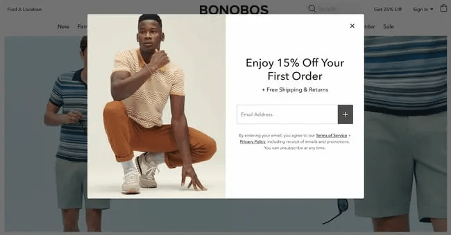
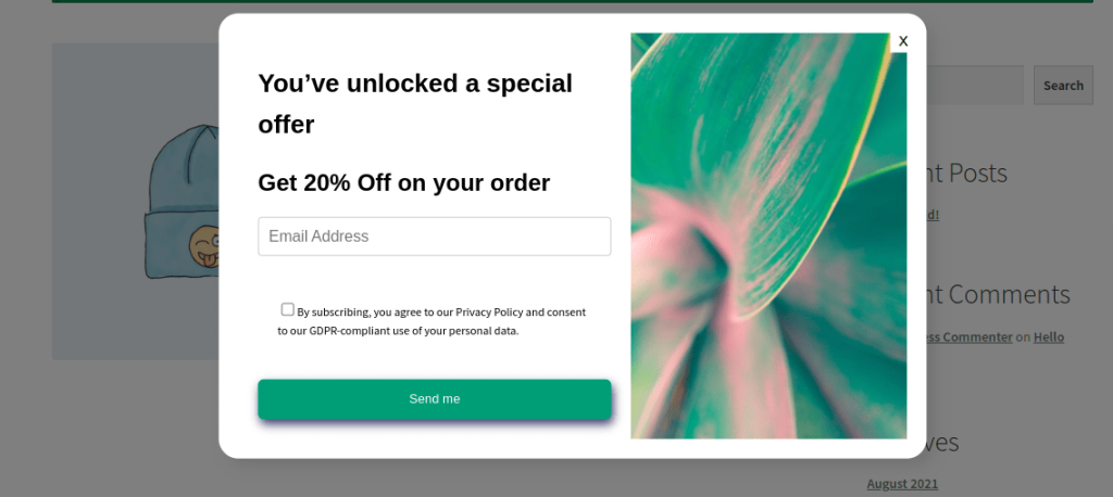
Welcome popups appear on a user’s screen shortly after they land on your website, grabbing their attentiSidebar Popupson and offering something valuable.
This is your chance to make a strong first impression and capture email addresses for future marketing efforts.
You can also use this type of popup to capture email addresses or other contact information in exchange for an incentive. This allows you to build your email list and nurture leads through email marketing campaigns.
Here is a welcome popup example.
What is a lightbox popup?
A lightbox popup is a specific type of popup that’s designed to focus your attention on a particular message or content by darkening the rest of the webpage.
This makes the popup stand out more and grabs your attention without completely taking you away from the webpage.
2. Exit-Intent Popups
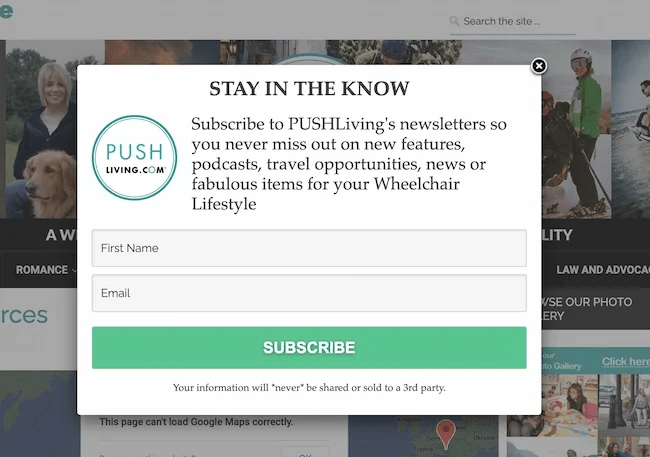
Exit-intent popups are triggered when a visitor’s cursor moves towards the close tab or address bar, indicating they’re about to leave the site. These types of popups are used to capture leads or offer last-minute deals to prevent cart abandonment.
Example: An online bookstore could use an exit-intent popup offering a discount code or reminding the user of the books they have left in their cart, encouraging them to complete the purchase.
Here is an exit-intent popup design example.
3. Add-to-Cart Popups
An add-to-cart popup is a type of ecommerce popup that appears on your website after a visitor adds a product to their shopping cart.
This type of popup acts as a nudge to increase impulse purchases, remind visitors of their selections, and ultimately prevent cart abandonment from happening.
Online shoppers get distracted, and sometimes, adding an item to the cart doesn’t translate to a completed purchase. A well-designed add-to-cart popup can serve as a gentle reminder, prompting them to revisit their cart and finish the checkout process.
Here is an example of an add-to-cart popup.
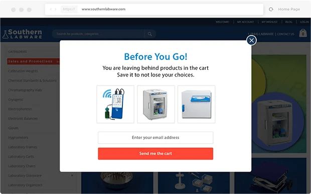
Recover abandoned carts with Retainful’s Add-to-cart popup that is triggered automatically.
4. Sidebar Popups
These type of popups appear alongside website content, typically on the left or right side, without completely disrupting the browsing experience.
Users can continue browsing the website while acknowledging the message. This creates a more user-friendly experience and reduces the risk of frustrating visitors.
Similar to welcome popups, these can be used as a popup for ecommerce to announce limited-time promotions or highlight new products or services. The discreet nature allows visitors to opt in without feeling pressured.
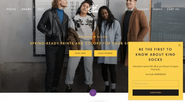
Here is an example of a sidebar popup.
5. Full-Screen Popups
Full-screen popups take over the entire screen and demand the visitor’s complete attention.
If not used thoughtfully, full-screen popups can disrupt the user experience and frustrate visitors.
A full-screen overlay that promotes a major sale or event, requiring user action to either engage with the offer or close the popup to return to the site.
When are full-screen popups most effective?
- Special offers and product launches: Announce limited-time sales, exclusive discounts, or new product launches with a visually captivating full-screen popup.
- Lead capture with high-value incentives: Offer a free downloadable resource, webinar registration, or valuable content in exchange for an email address.
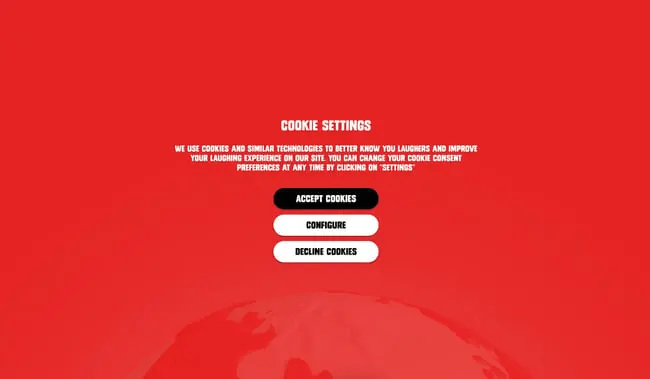
Here is a full-screen popup design example.
6. Timed Popups
These popups appear after a user has spent a specific amount of time on the site.
Unlike other popups, they eliminate bombarding visitors with messages right off the bat, which can be intrusive and off-putting.
Here’s when timed popups are most commonly used:
- Promoting additional content: After someone spends time on a blog post, a timed popup might showcase a relevant ebook or white paper to deepen their knowledge on the topic.
- Highlighting special offers: As a popup for ecommerce, if a visitor lingers on a product page for a while, a timed pop-up could offer a discount code or free shipping to incentivize a purchase.
- Capturing leads: After someone spends a certain amount of time browsing your website, a popup might appear encouraging them to sign up for your email list in exchange for a valuable resource.
7. Scroll-Triggered Popups
They are triggered after the user has scrolled through a certain percentage of a page.
By triggering based on scroll depth, you can tailor the popup content to the specific section of the page the visitor is viewing. This creates a more relevant and timely experience.
Here are some types of content commonly showcased with scroll-triggered popups:
- Targeted promotions: As a popup for ecommerce, if a visitor scrolls past a product category, a popup might showcase a discount or highlight complementary products.
- Lead capture forms: Reaching the bottom of a blog post with valuable content? A popup might offer a free ebook or email newsletter signup in exchange for an email address.
8. Feedback Request Popups
Feedback popups appear on a website or within an app, inviting users to share their thoughts and opinions. They act like tiny surveys, offering a quick and convenient way to gather valuable user insights.
Feedback popups show you care about the user experience. By actively gathering feedback, you demonstrate a willingness to improve based on user input.
Here are some common scenarios where feedback popups are most effective:
- After completing a task: Following a purchase, account creation, or downloading a file, a popup can ask users to rate their experience with that specific task.
- Encountering difficulties: If a user lingers on a page for an extended period or tries to navigate a complex section, a popup can appear asking if they need help or if anything is unclear.
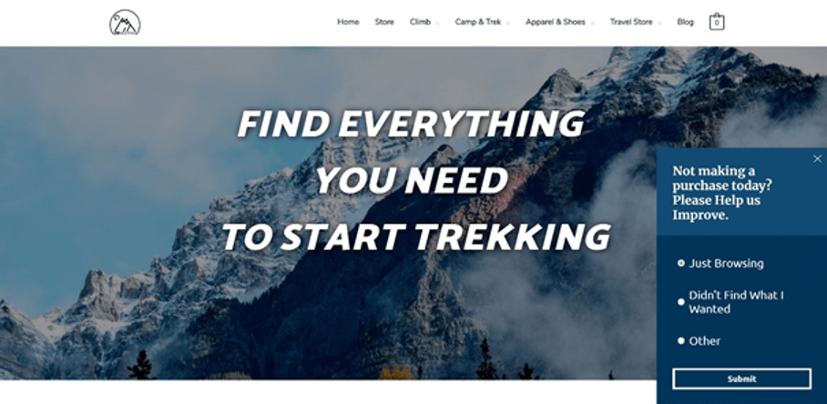
Here is an example of a feedback request popup.
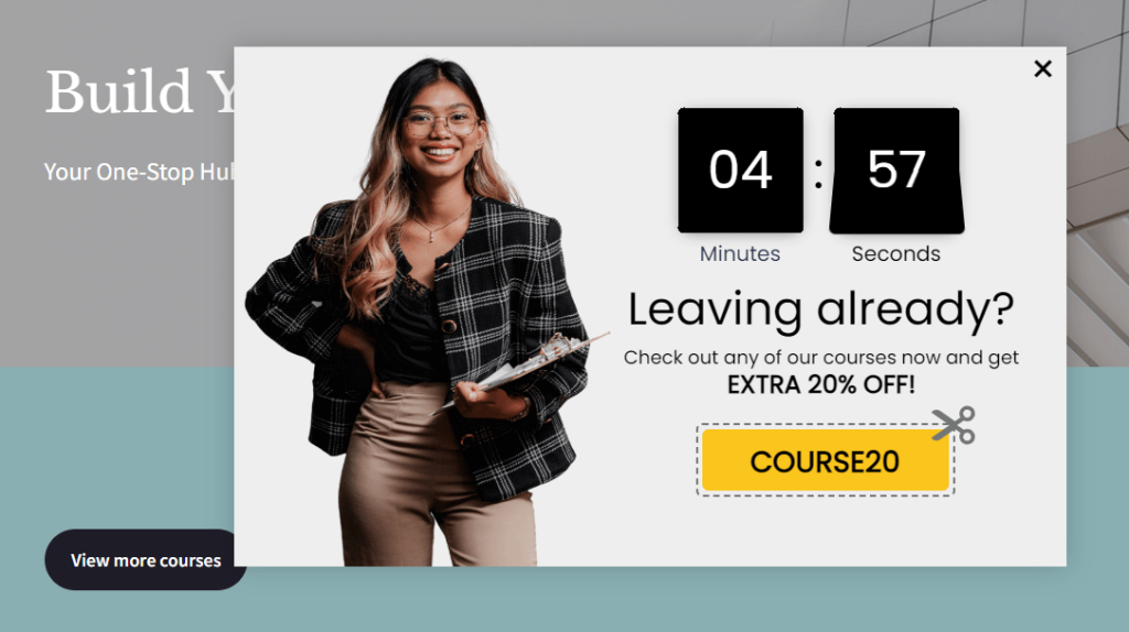
9. Countdown Timer Popups
Countdown timer popups are attention-grabbing tools that display a timer counting down to a specific deadline.
This type of popup injects a sense of urgency into your website, encouraging visitors to take action before the time runs out.
Here’s where countdown timer popups are most commonly used:
- Promotional offers: Highlight limited-time discounts, flash sales, or free shipping promotions with a countdown timer to boost sales during the offer period.
- Webinar or event registration: Create urgency for upcoming webinars or events by showcasing a countdown timer and encouraging early registration.
Related Reading: Want to confirm the subscription right after the sign-up? Learn how to send double opt-in emails: 7 Best Double Opt-in Email Examples + Best Practices
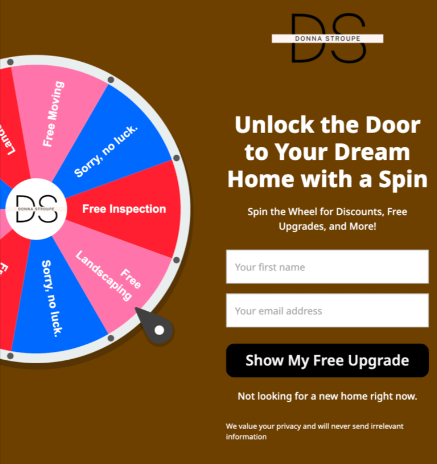
10. Gamified Popups
Gamified popups incorporate game elements to engage visitors. Common formats include spin-to-win wheels or quizzes that offer a reward.
- Content promotion: Use a spin-the-wheel game to give visitors a chance to win access to exclusive content like ebooks or webinars.
- Discount offers: Present discount codes through a scratch-and-reveal game, adding an element of surprise and excitement.
Related Reading: Explore the best email popup examples that excel in collecting email addresses: 15 Email Popup Examples And Best Practices To Build Email List
6 Popup Best Practices for High-Conversion Rate
Creating targeted popups for websites involves a delicate balance between engaging users and not disrupting their experience. You have to know when not to use a popup to avoid annoying the website visitors.
Here are some best practices for popup designing and implementing them:
1. Prioritize User Experience (UX) in popup design
As popups are usually considered intrusive, creating them with customer experience in mind is important.For e-commerce businesses, working with a UX design consultancy can help create popup experiences that balance conversion goals with user satisfaction.
You have to ensure the popup design looks good and functions well on all devices, particularly on mobile screens.
Frequent popups can frustrate users. Limit the number of times a popup appears to the same user.
When not to show a popup?
- Immediately upon arrival
- During critical tasks
- On every page or too frequently
2. Leverage targeting and segmentation
Group users based on their actions on your site, such as the pages they visit, the products they view, or how often they return.
For example, a visitor who frequently checks a particular product category might respond well to a popup offering a discount on their next purchase from that category.
Related Reading: Learn how to segment your email list in 10 different ways: Email Segmentation: 12 Strategies to Segment Email Lists
3. Nail the timing
Display popups based on user behavior, such as time spent on a page, scrolling depth, or exit intent, to ensure relevance and avoid interrupting the browsing experience unnecessarily.
4. Offering value for information exchange
Users are more likely to engage with a popup and provide their information if they perceive that they are receiving something valuable in return.
They are more likely to sign up for newsletters, download resources, or make a purchase if they perceive value in doing so.
5. Simplifying the lead capture process
Effective popups streamline the lead capture process, making it as simple as possible for users to submit their information.
This might mean designing popups with short forms that only ask for essential information (like name and email address) or integrating with social media platforms to allow for one-click submissions.
6. Easy exit and navigation
Make it easy for users to close popups if they’re not interested. Include clearly visible close buttons and consider allowing users to dismiss pop-ups by clicking outside the window.
Related Reading: Want to engage the subscribers right after the sign-up? Learn how to send welcome email series in our blog: Welcome Email Series – Examples + How to Create
How to Create a Popup?
Retainful is an email automation software that enables you to launch automated email campaigns for every step of the customer journey. Along with that, it also offers smart popups/sign-up forms to grow your email list effortlessly.
In this email capture software, the popups are triggered automatically based on visitor behavior and can be targeted to a specific group of customers.
The steps to create popups in Retainful:
- Choose the type of popup
- Choose the popup template
- Customize the popup template
- Configure the teaser and devices to show
- Choosing the audience
- Choosing the trigger and targeting
- Enable the popup
Let’s see the steps in detail.
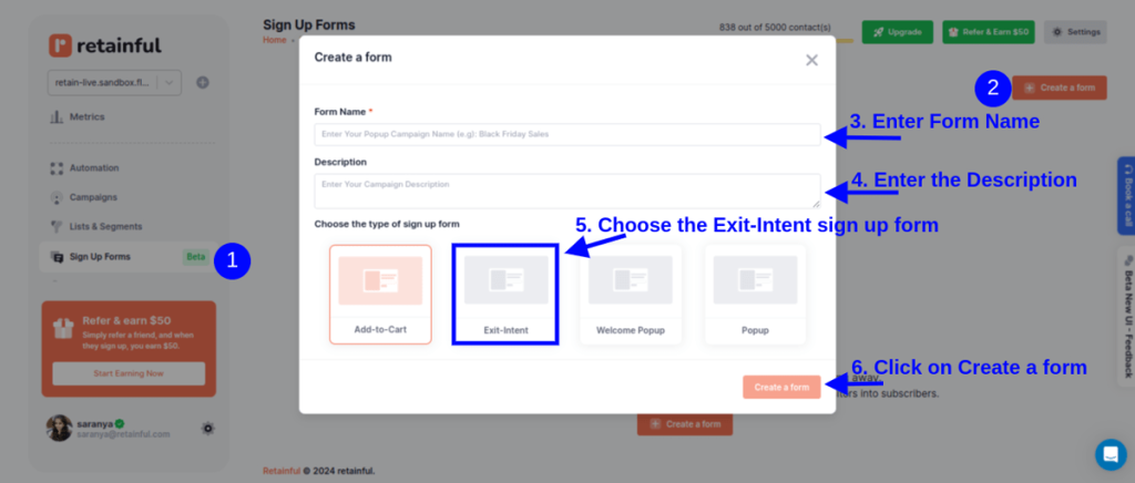
Step 1: Choose the type of popup
Login to your Retainful dashboard. Go to Sign-up Forms and click on ‘Create a Form’.
In this case, let’s choose the ‘Exit-intent popup’.
Step 2: Choose the popup template
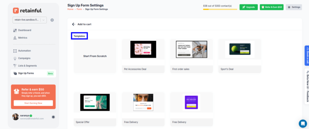
Retainful has many pre-designed popup templates to choose from, or you can create your own from scratch.
Step 3: Customize the popup template
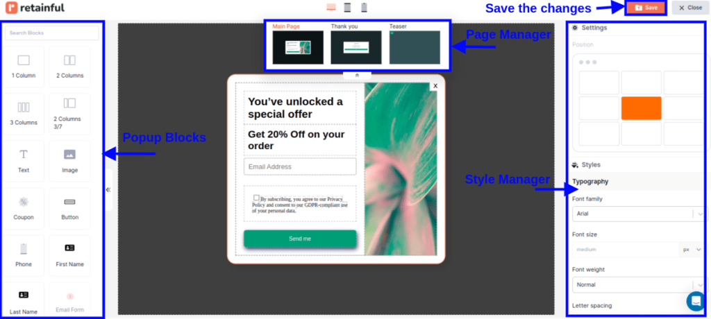
Retainful’s drag-and-drop editor offers a range of customizable blocks such as text, images, CTAs and more.
Step 4: Configure the teaser and devices to show
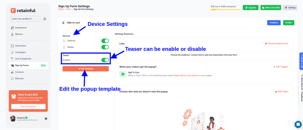
With the popup settings, you can set the following:
- Devices: Options to enable the popup for Desktop and Mobile.
- Teaser: A toggle to enable or disable the teaser of the popup.
- Edit template: A button to edit the popup template.
Step 5: Choosing the audience
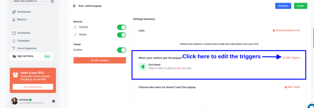
You can target the popups to a group of customers. You can add an existing list or create a new empty list from ‘List and Segments’ for new users using Retainful’s segmentation feature.
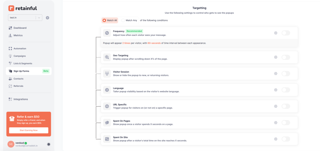
Step 6: Choosing the trigger and targeting
Choose the trigger that will automatically launch your popup.
In this case, let’s choose ‘Exit intent’.
You can also select multiple triggers to make your popups more tuned to the visitor’s behavior.
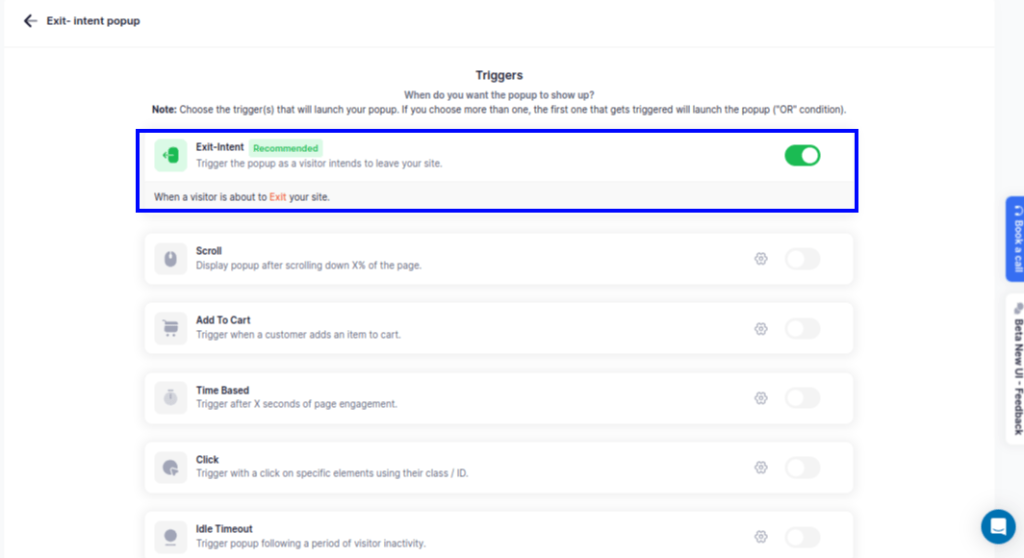
You can target the popup based on various visitor behaviors like how much time they have spent in the store, pages they have visited, and more.
Step 7: Enable the popup
After confirming your settings, enable the popup.
Get started with Retainful’s smart popups and grow your email list effortlessly.
Wrapping up!!
While popups can be super helpful, it’s important that they’re used in a way that isn’t annoying or gets in the way of what the visitor is doing on the site.
Good popups should show up at the right time with something valuable and know when to leave without causing a fuss.
We have seen what is a popup, why they are important, and some practical examples and types of popups.
Learn more about creating platform-specific popups:
- How to add a Newsletter Popup in Shopify?
- 10 Popup Best Practices + Examples
- WooCommerce Popup: How to Create [+Top Plugin]
- Discount Popup: 12 Examples + How to Create
Frequently Asked Questions
Pop-ups can be intrusive, disrupt the user experience, and annoy visitors if not used judiciously. They can distract from content, slow down web page loading times, and, if overused, may lead to increased bounce rates or blockage by pop-up blockers.
Pop-ups often get blocked because they can be intrusive and negatively affect the browsing experience. Many are used for advertising or spam, leading users to employ pop-up blockers to avoid unwanted interruptions and maintain a smoother web experience.
A pop-up blocker is a software or browser feature that prevents pop-up windows from opening automatically. It’s designed to enhance the browsing experience by blocking unwanted ads or potential malware from disrupting the user.
Having a pop-up on your website can be beneficial for engaging visitors, collecting emails, or promoting offers if used thoughtfully. It’s crucial to prioritize user experience by making them relevant, easy to dismiss, and not overly intrusive.
Push notifications are messages sent from an app to a user’s device, visible even when the app is not open, primarily used on mobile devices. Pop-ups are web-based, appearing while a user is browsing a website, requiring the website to be open to be seen.
Popup is a noun referring to a small window or element appearing on a screen. Pop-up (hyphenated) is an adjective or noun describing temporary events, features, or displays.

