Responsive emails aren’t just a nice-to-have; they’re a must. You’re sending beautifully crafted emails, but if they show up broken, unreadable, or too small on a mobile device?
You lose clicks and conversions that you would have otherwise earned easily.
Designing a responsive email won’t be a hustle if you know what goes into making them.
In this blog, we explain,
- What is a responsive email?
- How to design responsive emails?
- How to measure email responsiveness?
Design responsive ecommerce emails with Retainful’s pre-designed email templates and drag-and-drop email editor.
What is a responsive email?
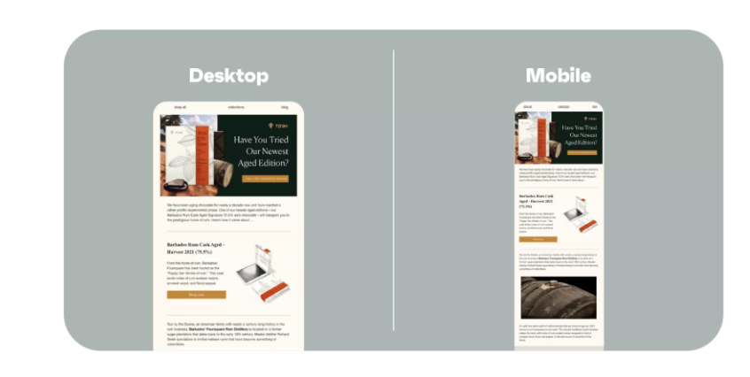
A responsive email is an email designed to automatically adjust its layout and formatting to fit various screen sizes and devices.
Whether it’s viewed on a desktop, tablet, or smartphone, a responsive email design adapts to the screen, making the content easy to read and navigate.
Here is a responsive email example:
Why email responsiveness is important to increase sales?
- Increases email click-through rates by up to 15%.
- Reduces bounce rates by 30%.
- 24% increase in revenue per email.
How to design responsive emails?
Designing responsive emails ensures your emails look great and are easy to read on any device, whether it’s a smartphone, tablet, or desktop. With more than 60% of emails opened on mobile, responsive email design is crucial. Here’s how to get it right.
Step 1: Use a single-column layout
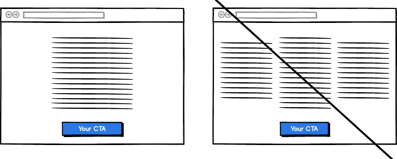
Forget multi-column. On mobile, it’s a nightmare. Stick with one clean column. Simple, readable. It ensures your content flows naturally, whether it’s on a 6-inch phone screen or a widescreen desktop.
Why? Multi-column layouts in the email design get squashed on mobile. Your text becomes too small, images overlap, and you’re asking the reader to zoom and scroll in frustration.
Here is a responsive email example:
Step 2. Include big, bold fonts
To create a responsive email design, use 16px or larger for your body text. For headlines? At least 22px. It’s about making your marketing emails instantly readable without readers having to zoom.
Step 3. Make your CTAs unmissable
Your Call to Action (CTA) button is your money-maker. Make it big. Make it bold.
And don’t be shy with contrast. If your email template background is white, make that button color that contrasts the background.
Here is an example of CTA in a responsive email.

Step 4. Include whitespace
Don’t cram everything into one email. Let it breathe.
Whitespace in the responsive email design makes your content more digestible, especially on mobile screens where everything feels smaller. It helps highlight important elements, like CTAs and headlines.
Step 5. Keep the image file size low
Big images = slow load times. If your email takes more than 3 seconds to load, it’s getting closed. Compress your images to under 1MB, make sure they load fast, and send responsive emails.
Step 6. Test on multiple devices
This is crucial. Your email design might look flawless on a desktop, but how does it look on mobiles?
Preview your emails on as many devices as possible. Use tools like Litmus or Email on Acid to see how your email will render across different platforms and send responsive emails.
How to measure email responsiveness?
Most major email platforms like Retainful or tools like Litmus or Email on Acid show below metrics to measure email responsiveness.
Open Rate by device
Track how many recipients open your emails on mobile devices vs. desktops.
Click-Through Rate (CTR) by device
CTR shows how many recipients clicked on a link in your email. Track this separately for mobile and desktop users.
A low CTR on mobile might mean your CTAs or content aren’t optimized for smaller screens. Buttons might be too small, or text may be hard to read.
Bounce rate
Bounce rate refers to the percentage of emails that didn’t make it to the inbox.
High bounce rates can indicate that your email design isn’t rendering properly across devices or that the email is getting flagged as spam due to unresponsive content.
Rendering speed
Measure how quickly your emails load on different devices, particularly mobile.
Slow load times (caused by large images and heavy HTML) lead to higher abandon rates.
Design mobile-friendly emails effortlessly with Retainful. No coding required.
Wrapping up!!
Responsive emails aren’t optional anymore. A non-responsive email gets ignored, deleted, or worse, marked as spam. But when your email adjusts perfectly to any screen – whether it’s a desktop at work or a smartphone on the go – you will see more click-through rates and conversions.
In a responsive email design, every pixel, every CTA, and every image works for your reader, not against them.
Frequently Asked Questions
Over 60% of emails are opened on mobile devices, and if your email isn’t responsive, you risk losing engagement, click-throughs, and conversions.
Use a single-column layout, larger font sizes, fluid images, and ensure buttons are tappable. Always test on multiple devices.
A single-column layout stacks content vertically, making it easier to read and scroll on mobile devices, avoiding the complexity of multi-column designs.
Use at least 16px for body text and 22px or more for headlines to ensure readability on small screens.
While possible, multiple columns can break on mobile devices. It’s best to use a single-column layout for high email responsiveness.
Compress images, avoid heavy graphics, and keep the email’s total size under 100KB to ensure quick loading on mobile devices.
Ensure your CTA button is large, clearly visible, centered, and contrasts with the background color. It should be easy to tap, with a compelling call to action, like “Shop Now.”
Whitespace ensures content is easy to read and navigate on mobile. It prevents overcrowding and makes elements stand out.
