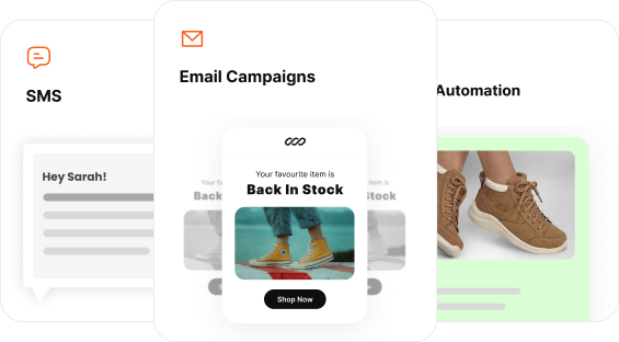
Discount popups convert like crazy. They catch the attention of your potential customers and prompt them to take action – place the first purchase, sign up for your newsletter, or finish the checkout process.
Their benefits are clear: increased conversions, reduced cart abandonment, and a growing email list.
Use them poorly, and you risk annoying your visitors or, worse, driving them away. It’s a fine line to walk, but discount popups can turn casual browsers into customers when done right.
In this blog, you will learn when and where to use discount popups, 12 high-converting examples, and how to create one for your own site.
Create targeted discount popups that convert more with Retainful.
What is a discount popup?
A discount popup is a marketing tool for capturing the attention of website visitors by offering them a discount and converting them into customers or subscribers.
These popups are often triggered by specific user behaviors or actions, such as when a visitor is about to leave the site (exit intent), after a certain amount of time spent on the page, or upon scrolling to a particular section.
The primary goals of discount popups are:
- Increase conversions
- Reduce cart abandonment
- Grow the email subscriber list
When and where to show discount popups?
The success of discount popups hinges on when and where they are shown to the visitors.
Here is how to time and place the discount popups on your website.
- On Entry
Greet new visitors with a discount popup to capture their attention immediately and encourage them to explore the site further.
Trigger the popup a few seconds after the visitor lands on the page to avoid overwhelming them instantly. - Exit-Intent
Use exit-intent technology to display a popup when visitors are about to leave the site. This can help reduce cart abandonment and convert potential exits into sales. - Time-Based
Show a discount popup after a visitor has spent a certain amount of time on the site or on a specific page.
Typically, a delay of 30-60 seconds is effective for triggering time-based popups. - Scroll-triggered
Display a popup after a visitor has scrolled down a certain percentage of a page, indicating engagement and interest in the content.
For example, trigger the popup when visitors have scrolled 50-70% down the page to ensure they are actively engaged. - On Click
Show the discount popup when visitors click on specific elements, such as banners, buttons, or links, indicating their interest in a particular offer or product.
12 Best Discount Popup Examples
There are many ways to design a discount popup – it can be a slide-in popup, a spin wheel one or a simple lightbox popup.
Here are the 12 best discount popup examples.
1. Limited-time discount popup
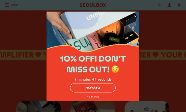
The countdown timer makes all the difference. It is prominently displayed and reinforces the urgency of the offer, pushing visitors to act quickly.
Timers create a fear of missing out, prompting visitors to act quickly to take advantage of the offer before it expires. This urgency can lead to impulsive buying decisions.
Also, visitors are less likely to procrastinate when they see a ticking timer. The immediate need to act reduces the chances of them leaving the site without making a purchase.
The discount code “HOYA10” is clearly displayed, making it easy for visitors to understand how to use the offer.
The “No thanks” option provides a polite way for visitors to dismiss the popup, respecting their choice and improving user experience.
2. First-order discount popup
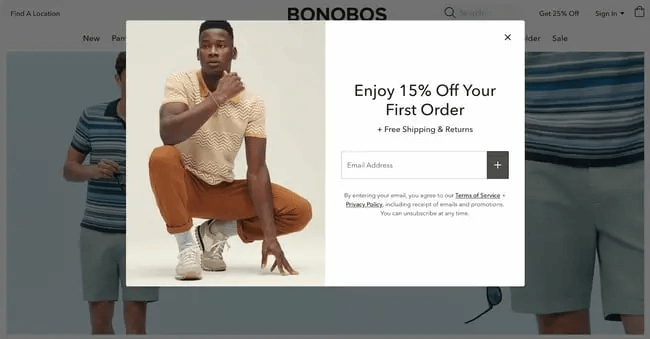
Offering a discount on the first order is a compelling incentive for new visitors to make a purchase. It reduces the entry barrier.
The headline is straightforward and immediately communicates the offer. There is no ambiguity about what the visitor will receive.
Highlighting free shipping and returns adds extra value to the offer, making it even more attractive to potential customers.
The image of a model wearing the brand’s clothing creates visual interest and reinforces the brand’s identity.
3. Email subscription discount popup
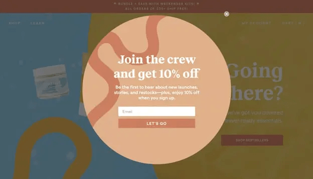
By offering a discount in exchange for an email address, these popups effectively build a valuable email list for future marketing efforts.
The phrase “Join the crew” creates a sense of community and belonging, making visitors feel like they are becoming part of something special.
In your email subscription discount popup, highlighting additional benefits like early access to new launches and restocks adds value to the offer, making it more compelling.
4. Spin the wheel discount popup
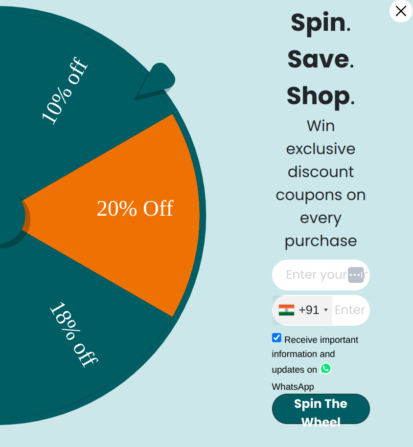
The spinning wheel adds fun and creates anticipation of winning a discount.
Clearly communicates the benefit of participating – winning exclusive discounts. The promise of winning something on every purchase further motivates users to take action.
By offering the option to receive updates via WhatsApp, the popup leverages another popular communication channel, enhancing user engagement and keeping them informed.
The checkbox for receiving important information ensures compliance with communication preferences and GDPR regulations.
5. Exit-intent discount popup

This exit-intent discount popup is designed to capture the attention of users who are about to leave the website and persuade them to stay by offering a discount.
This popup uses Call-to-benefit instead of call-to-action. Call-to-benefit makes the action not feel like a task. Here is an example:
- Call-to-action: Subscribe, Sign-up
- Call-to-benefit: Get 10% off
Clearly communicates the benefit of subscribing – a 10% discount on their order. This gives users a tangible reason to stay and engage.
Capture email addresses at strategic times using Retainful’s advanced triggers like exit intent, scroll depth, time spent, and more.
6. Special occasion discount popup
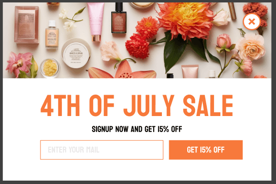
The headline leverages a specific event (4th of July), adding urgency and relevance to the offer.
The use of a cohesive color scheme (orange and white) aligns with the theme and is visually appealing. The orange color is bright and attention-grabbing, while the white background keeps it clean and easy to read.
Mentioning which of the items in the store get the offer tells the customer what to expect – is it sitewide or a product-specific discount?
The “X” button at the top right provides an easy way for users to close the popup if they are not interested.
7. Add-to-cart discount popup
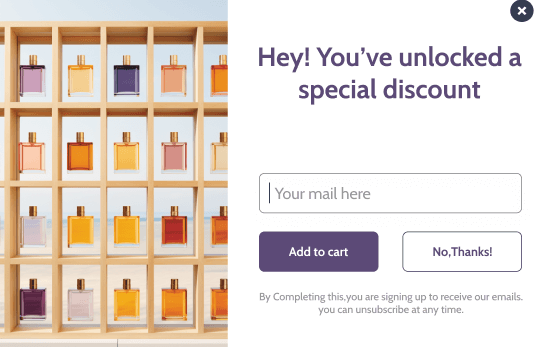
By offering a discount at the moment items are added to the cart, shoppers are more likely to proceed to checkout rather than abandoning their cart.
The headline clearly communicates the benefit of engaging with the popup – a special discount.
The “No, Thanks!” button provides an easy way for users to dismiss the popup if they are not interested.
It ensures transparency by informing users that by entering their email, they are subscribing to receive emails.
8. Birthday gift discount popup
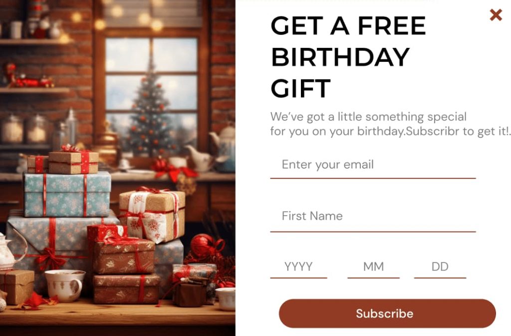
The promise of a free birthday gift creates a sense of excitement and value, encouraging visitors to provide their details.
A birthday gift provides a timely incentive for customers to make a purchase, leading to higher engagement and conversion rates.
With birthdate information, you can send personalized birthday offers and other targeted campaigns, improving email marketing effectiveness.
The use of warm, cozy colors aligns with the theme of celebration and gifts, making the popup visually appealing.
9. Welcome discount popup
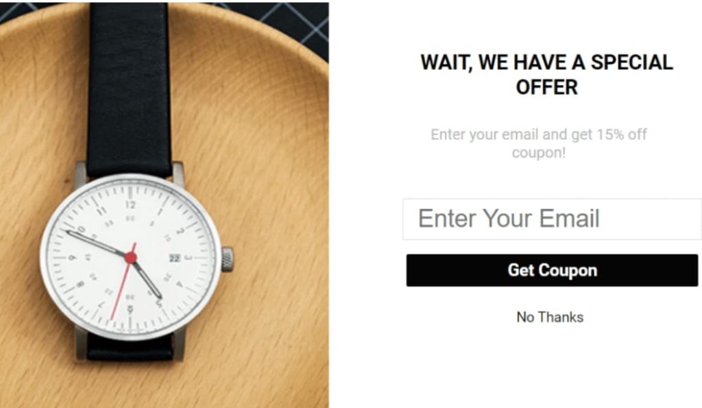
The use of “WAIT” creates a sense of urgency and stops visitors from leaving, while “WE HAVE A SPECIAL OFFER” generates intrigue and interest.
Clearly states the benefit of providing an email address—a 15% discount. This gives visitors a tangible reason to engage with the popup.
The text “Get Coupon” is clear and encourages immediate action, making it easy for users to understand what they need to do.
10. Slide-in discount popup
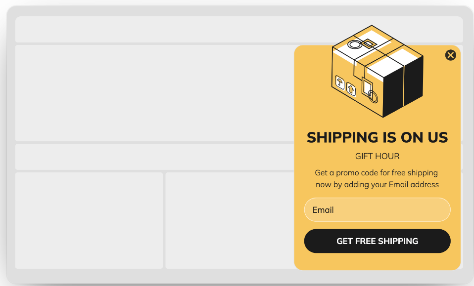
The slide-in effect is less intrusive than a full-screen popup, making it less likely to annoy visitors while still capturing their attention.
The headline immediately communicates the main benefit – free shipping. This is a strong incentive, as shipping costs are a common barrier to completing purchases.
The phrase “SHIPPING IS ON US” is straightforward and leaves no ambiguity about the offer.
Discount popups should clarify how the user can redeem the offer. This example says that the user will receive a promo code for free shipping by adding their email address.
11. Scratch card discount popup
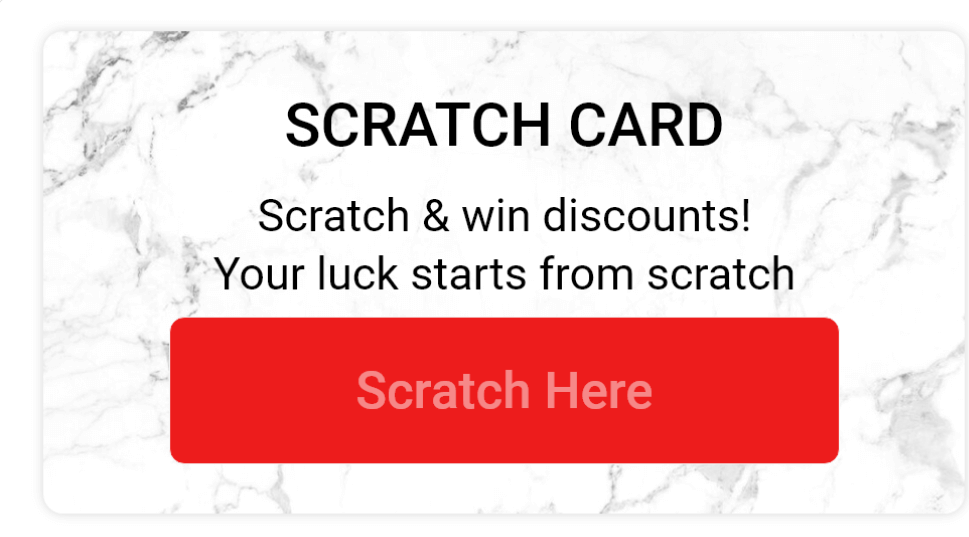
It is an example of gamification in popups, which makes claiming the discount an experience.
An interactive element like scratch makes it more engaging and brings in curiosity to the process. These type of discount popups can increase conversions as users are keen to see what they win.
The directive “Scratch Here” is clear and encourages immediate action, making it easy for users to understand what they need to do.
12. Discount popup for segmentation
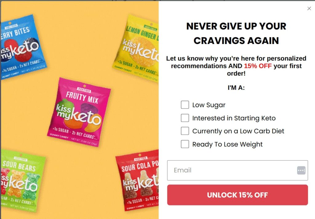
Ideally, creating popups with a single field works well.
If you are into email segmentation and want to personalize emails based on the preferences of the customers, asking for additional info in the popups is recommended.
Kiss My Keto can deliver more relevant recommendations and offers in their email campaigns by collecting information about dietary preferences (low sugar, keto, low carb, weight loss).
Use of the checkboxes is a nice touch. It engages users by asking for their preferences, making them feel involved and understood.
The CTA button is large and prominently placed, ensuring it stands out against the background.
How to Create a Discount Popup?
Creating a discount popup is easier than ever with email capture software like Retainful.
Retainful is an all-in-one email marketing software tailor-made for e-commerce. It features targeted sign-up forms and popups that capture the email addresses of the visitors and convert them into subscribers and customers.
With Retainful, you can increase your conversion rate by:
- Precise targeting – Based on geo-location, time spent on pages, new or returning customers, and more.
- Triggers – Based on time spent, scroll-depth, exit-intent, add-to-cart, and more.
- Mobile-optimized popup templates – Responsive pre-designed templates
Here are the steps to create a discount popup:
Step 1: Install Retainful
Install Retainful and activate it in your ecommerce store.
Step 2: Select the popup type
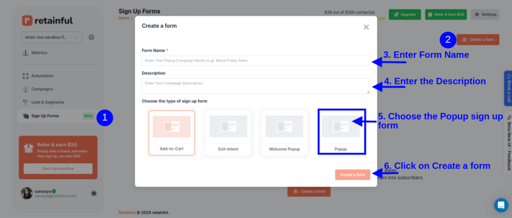
Login to your Retainful dashboard. Go to Sign-up Forms, choose ‘Popup’ and click on ‘Create a Form’.
Step 3: Customize the popup template
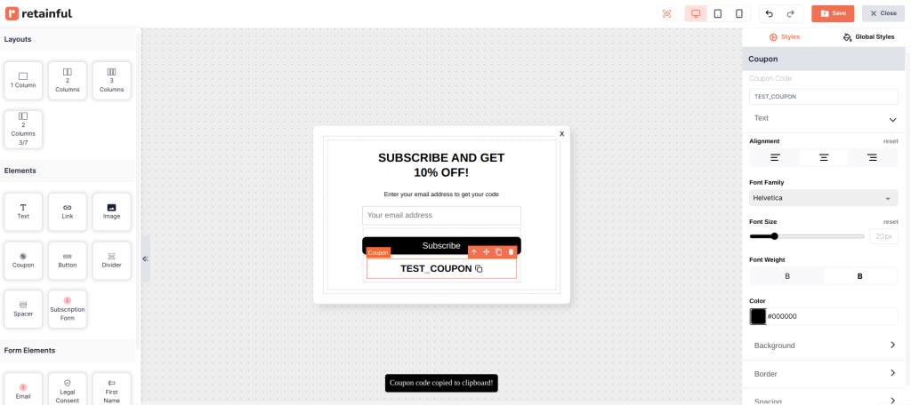
Retainful’s drag-and-drop editor offers a range of customizable blocks such as text, images, CTAs, dynamic coupon block and more.
Step 4: Setup triggers and targeting
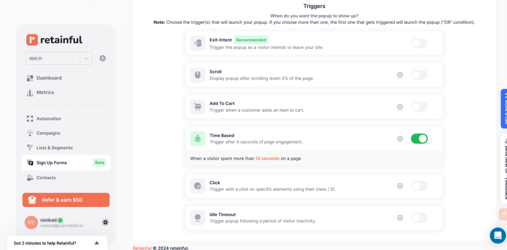
Choose the trigger to determine when you want to show the discount popup.
You can also select multiple triggers to make your discount popup more tuned to the visitor’s behavior.
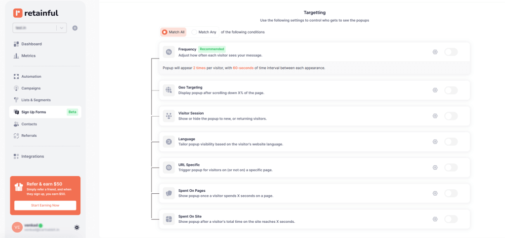
In the targeting, choose who should see your discount popup. For example, you can show popups based on the location they are on.
Step 5: Go Live.
After confirming your settings, enable the pop-up. Your pop-up will be set live.
Target the quality leads with Retainful’s advanced popup targeting options and grow your email list.
Wrapping Up!!
Discount popups offer a straightforward path to higher conversion rates and lower cart abandonment, serving as timely nudges that turn browsers into buyers.
More than that, they help build a rich email list, a direct line to customers who are already interested in what you have to offer.
We have seen when to use discount popups, the high-converting examples, and how to create one using Retainful.
Frequently Asked Questions
A pop-up discount is a promotional offer that appears as a small window on a website, providing visitors with a special deal or discount in exchange for an action, such as signing up for a newsletter or making a purchase.
Yes, pop-up discounts work effectively by capturing visitors’ attention, encouraging immediate action, and providing incentives that reduce hesitation, ultimately leading to higher conversion rates.
To add a discount pop-up to a website, use a pop-up builder tool like Retainful, design the pop-up, and set targeting and triggers.
Write a discount offer message by clearly stating the discount, creating a sense of urgency, using persuasive and concise language, and including a strong call to action. Example: “Save 20% today!
Yes, pop-ups increase sales by grabbing visitors’ attention, offering incentives like discounts or free shipping, and prompting immediate actions that reduce cart abandonment and encourage conversions.

