Ever slammed your cursor in frustration at those pesky email popups? You know the ones – rudely interrupting your browsing experience.
But hold on! What if I told you these popups could be your secret weapon? A way to turn casual visitors into loyal audiences?
Get ready because we’re about to dissect 15 of the best email popup examples. These popups ditch the annoyance and embrace value, humor, and genuine connection. They’ll have you rethinking this marketing tool entirely, showing you how popups can be powerful tools for connection, not just collection.
Automate email popups with Retainful and provide value to keep customers engaged.
What is an Email Popup?
An email pop-up is a temporary window or dialog box that appears on a window or website’s interface to capture the email address of the website visitor. It is also known as a newsletter pop-up, email capture pop-up, email sign-up pop-up, or email subscription pop-up. They are designed to capture visitor attention.
In exchange for the email address, the popup may offer an incentive such as a discount code, exclusive content, or early access to information.
Popups can be triggered by various events, such as upon initial page load, after a certain amount of time spent browsing, or as the user attempts to leave the website (known as exit-intent popups). Their primary purpose is to grow an email list for marketing and promotional efforts.
Types of Email Popups
There are several different types of email popups, each with its own strengths and weaknesses. The best type of email popup for you will depend on your specific goals and target audience. Consider what kind of incentive you’re offering, how you want to trigger the popup, and what kind of user experience you want to create.
Here are the types of email subscription popups.
- Welcome Popups: These email popups appear as soon as a visitor lands on your website. They’re a great way to introduce yourself and offer a quick incentive in exchange for an email address.
- Exit-Intent Popups: These email sign-up popups are triggered when a visitor moves their mouse toward the top of the browser window, indicating they’re about to leave your site. They offer a last-ditch effort to capture their attention and encourage them to subscribe before they bounce.
- Newsletter popup: These popups invite visitors to sign up for the site’s email list with their email address. They often offer an incentive, like a discount or free content, in exchange for signing up.
- Timed Popups: These popups appear after a set amount of time has passed since a visitor arrives on your website. These email popups are a good option for giving visitors a chance to engage with your content before interrupting them.
- Scroll-Triggered Popups: These email capture popups appear when a visitor scrolls down to a certain point on your webpage. They’re a good way to capture attention as visitors are actively consuming your content.
- On-Click Popups: These popups appear when a visitor clicks on a specific element on your website, such as a button or image. They’re a good way to offer targeted incentives based on visitor behavior.
- Gamified Popups: These popups use games or interactive elements to capture attention and encourage signups. They can be a fun way to stand out from the crowd.
Email popup best practices
Here are some email popup best practices to maximize your chances of capturing leads and avoiding annoying visitors:
- Offer Value:
Don’t just ask for an email address! Provide a clear incentive in exchange for signup. This could be a discount code, exclusive content (like ebooks or guides), early access to sales, or valuable industry insights. - Keep it Simple:
People are busy. Use concise copy and a clean design with minimal form fields (just the email address is usually enough). - Timing is Key:
Don’t bombard visitors with popups right away. Consider using timed popups after they’ve spent some time on your site, scroll-triggered popups based on content engagement, or exit-intent popups as a last chance to capture their attention. - Target Your Audience:
Not all visitors are created equal. Consider showing different popups based on visitor behavior, browsing history, or even location to personalize the experience and offer relevant incentives. - Mobile Friendly:
A significant portion of web traffic comes from mobile devices. Ensure your popups are responsive and designed for a smooth mobile experience. - Clear Call to Action (CTA):
Tell visitors exactly what you want them to do! Use strong verbs and contrasting button colors to make your CTA stand out. - Design Matters:
Make sure your popups are visually appealing and align with your website’s overall design. Avoid overly intrusive designs or distracting animations. - Test and Refine:
Like any marketing strategy, A/B testing different popups with variations in copy, design, and timing can significantly impact your conversion rate. - Respect User Privacy:
Be clear about how you’ll use the collected email addresses and offer an easy unsubscribe option in every email communication. - Exit Strategy:
Allow users to easily close the popup without feeling trapped. A simple “X” button in the corner is all that’s needed.
Best email popup examples
1. Welcome popup example
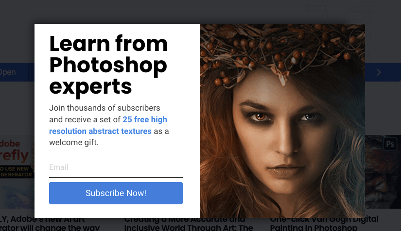
When you offer a free gift to welcome new customers, it is going to build trust and foster customer loyalty. Photoshop Mosaic offers 25 free high-resolution abstract textures in this email popup example in exchange for their email address. This sets them apart from other brands and builds good rapport.
2. Newsletter popup example
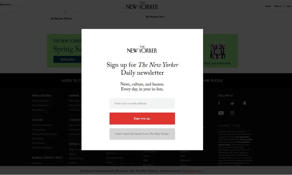
This is a very straightforward email subscription popup example from NewYorker. The design of this newsletter popup is very clear and uncluttered, and the CTA button looks very inviting. This distraction-free popup design is sure to catch the reader’s attention.
Send newsletters to your customers by capturing their email addresses using attractive newsletter popups of Retainful.
3. Countdown email popup example
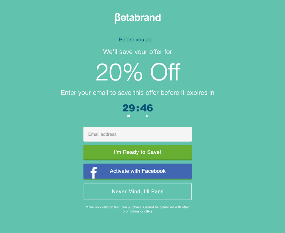
You can always spice up your email capture popup with a countdown timer. Dangle a discount like BetaBrand but with a time constraint to induce FOMO. The email popup example also has an opt-out option at the end, which shows how considerate they are to user preferences.
4. Next order coupon example
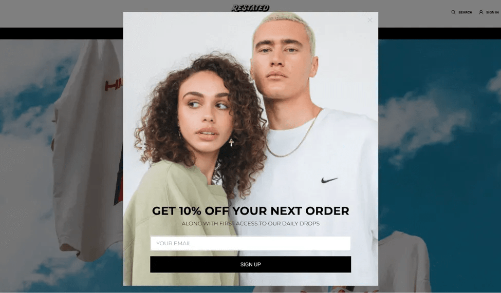
You don’t always have to offer first-time discounts. You can also offer next-order coupons or discounts. Nike has just created a very simple but effective next-order discount email subscription popup example. All you have to do is find the right plugin that lets you create next-order coupons and email popups.
5. Free shipping email popup example
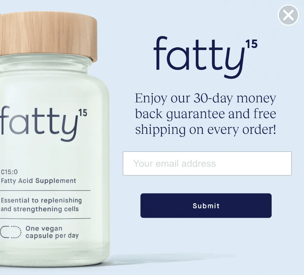
About 24% of customers abandon their carts because of shipping costs. This email popup example from Fatty15 strategically uses its email subscription popup to eliminate the shipping costs issue and also offers a money-back guarantee in exchange for the customer’s email address. This email capture popup is a great example of providing value and capturing the email address.
6. First order discount email pop-up
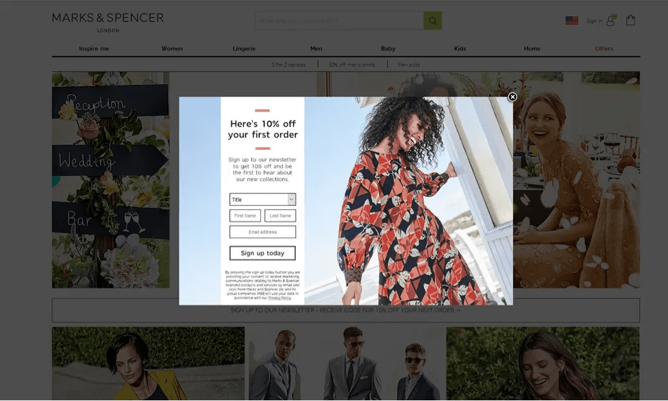
Here’s another email subscription popup example that helps hesitant customers. Of course, first-time customers will have their doubts. Marks and Spencer has taken 10% off the first-time order to help ease any hesitations. Though the popup has a lot of fields, it still looks uncluttered and even has a visible exit button.
7. Email subscription popup example
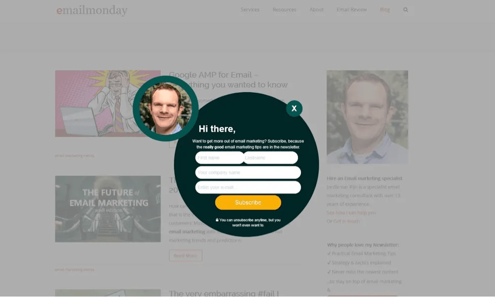
Did the unique shape of this email subscription popup catch your attention, too? You have got to give it to them for putting effort into coming up with something out of the box. This email popup example from EmailMonday went a step further by adding the face of their email specialist as a trust element.
8. Brand aesthetic email sign up popup example
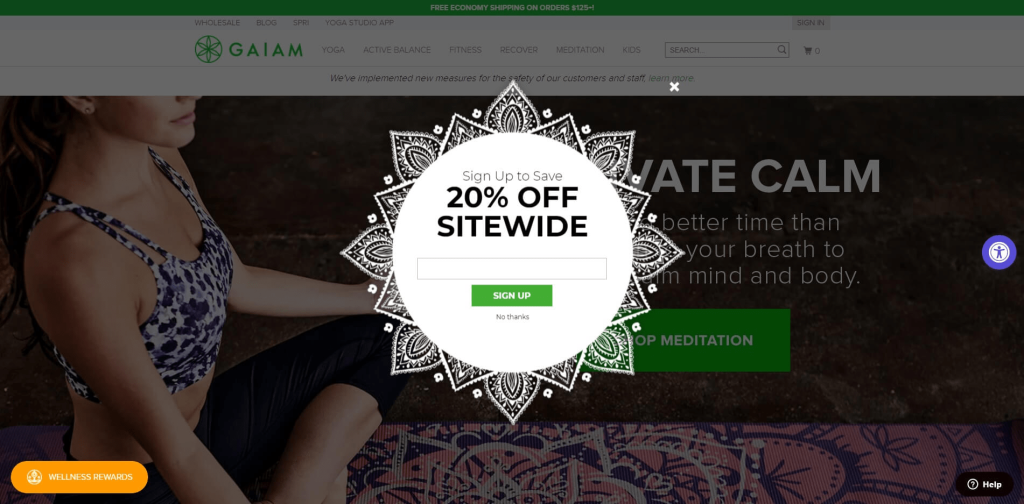
Gaiam is a Yoga store, and its email sign-up popup shows its brand’s aesthetic through a very calming image of a person meditating and a mandala-shaped popup. This email capture popup example offers 20% site-wide, which is very irresistible.
9. Discount lightbox popup example
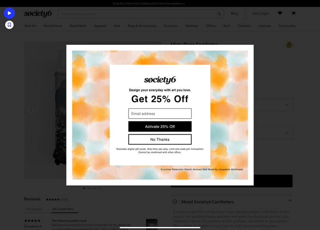
This email popup example is a lightbox popup. A lightbox popup blurs out the rest of the content while bringing the spotlight on itself. Society6’s email subscription popup example offers 25% off and also offers an option to opt out of providing their email address, which shows that they really care about their customers’ preferences.
Related Reading: How to Setup Exit Popups for Abandoned Cart in WooCommerce?
10. Alternative position popup
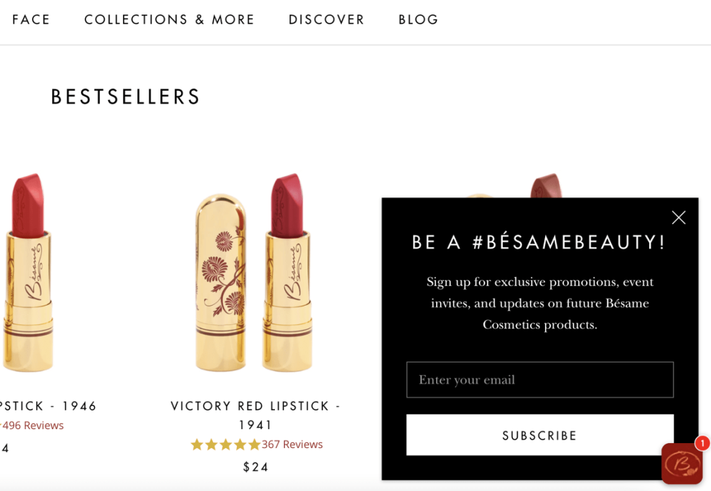
Some customers might find the email pop taking up the whole screen very annoying. In such cases, A/B test alternate positions to find which works better. Besame cosmetics has placed their email subscription popup toward the side of the screen, which eliminates the intrusive factor.
11. Free guide email popup
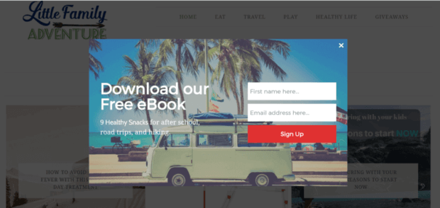
Free guides always generate buzz, especially if they contain healthy recipes. Little Family Adventure’s email subscription popup example offers a free eBook in exchange for an email address and name. Also, the design is like a breath of fresh air conveying how the recipes will be helpful during hiking and road trips.
12. Unconventional design email subscription popup example
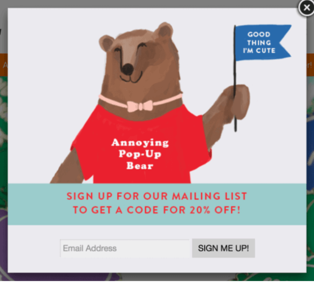
It is cute, unconventional, and calls itself annoying. Add a character to your email pop like this example to keep it fun and light. Also including an easy exit button makes it even more attractive.
13. Gamified email sign up popup example
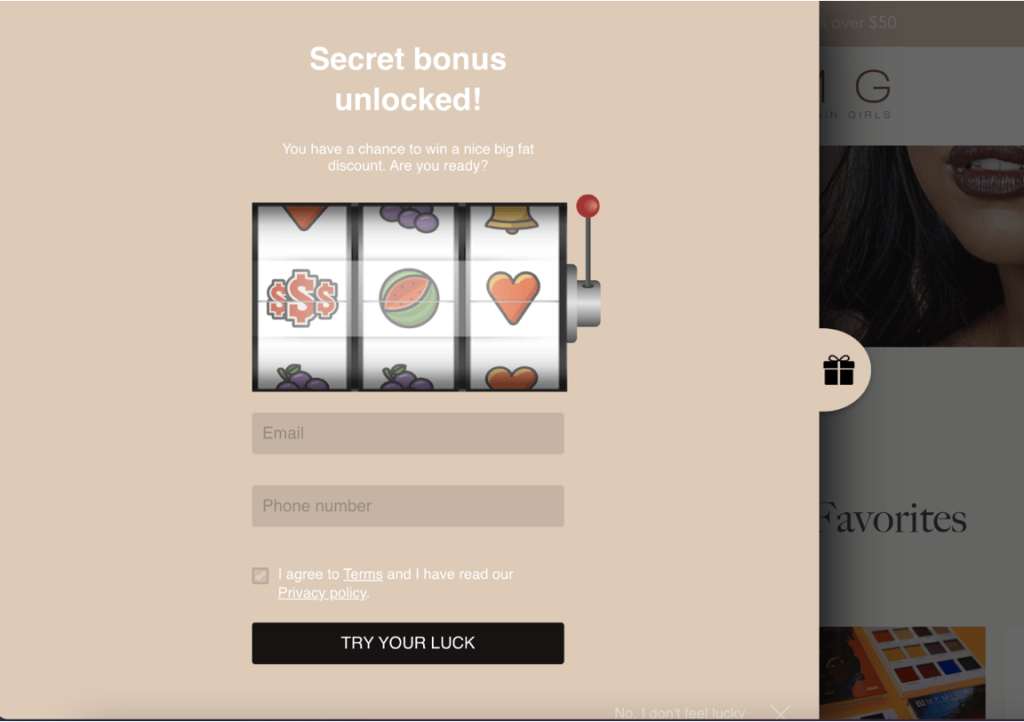
Excite your customers with gamified email popups. Look at this email subscription popup from MFMG Cosmetics. People who think popups are intrusive and press the exit button might love a gamified popup. MFMG asks for the email address and phone number, and in exchange, the customer can click on the try-your-luck CTA button to see what kind of discount they could get.
14. Sticky bar email popup
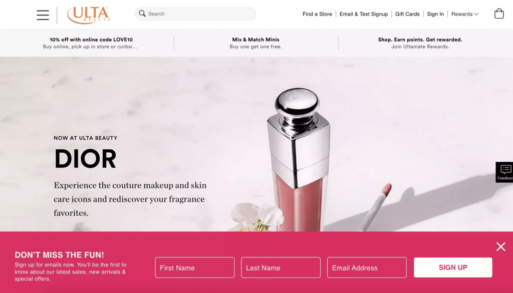
These are the types of email capture popup examples that are always adhered to one side of the screen. Ulta’s sticky popup is at the bottom of the screen and looks the least intrusive. Also if you find that annoying, you can always click on the exit button.
15. Yes/no email popup example
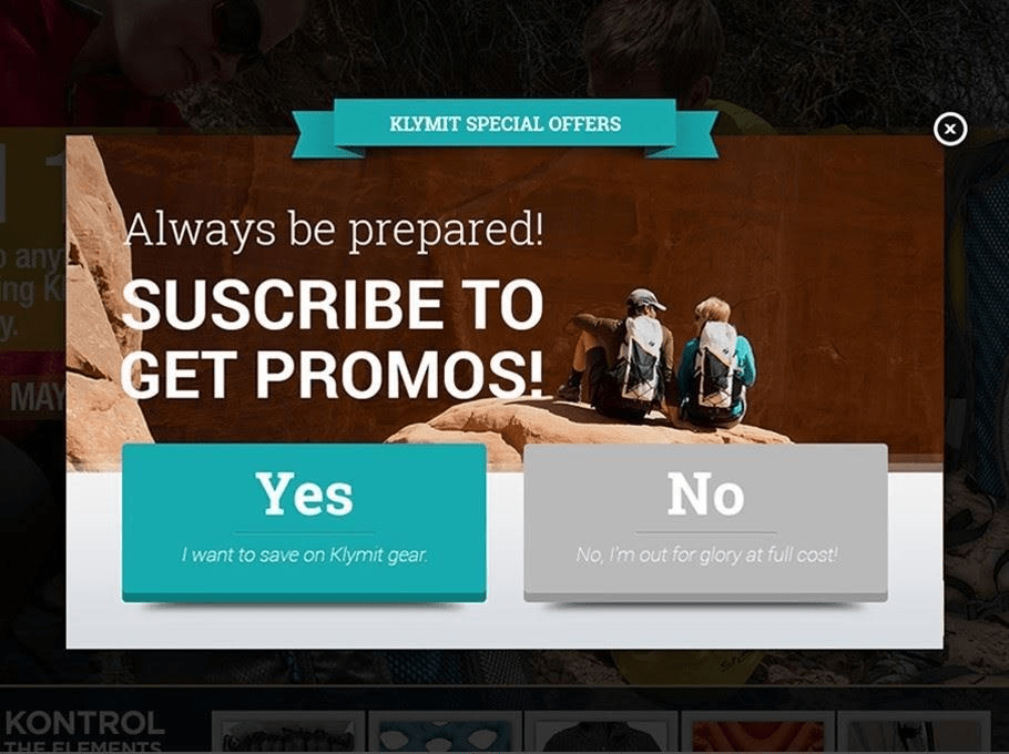
It can’t get any more straightforward than this yes/no email subscription popup example. Klymit has given its users a yes/no option to subscribe. This seems less intrusive, and handing the entire decision to the users seems very considerate.
Create personalized email popups and capture email addresses to build a healthy email list.
Wrapping up
When email popups are crafted with value, humor, and personalization, they can be powerful tools to turn website visitors into loyal fans.
This blog explored different pop-up types, from welcome messages to discount offers. We saw how pop-ups can provide valuable incentives and segment audiences for targeted promotions.
Remember, effective pop-ups are just the first step. Building relationships requires nurturing leads through email marketing automation and customization. A tool like Retainful can help you create high-converting pop-ups and craft automated email journeys that keep your audience engaged.
Read next:
20 Best Exit Intent Popup Examples to Capture Leads
Frequently Asked Questions
You can’t directly “pop-up” an email. Pop-ups are website features, but email marketing tools can trigger them based on visitor behavior.
A pop-up message might offer a discount code in exchange for your email address when you visit a clothing website.
Imagine a small window appearing on a website offering a free guide. That’s a website pop-up used in email marketing.
In email marketing, a pop-up is a website window that appears to capture visitor email addresses, often in exchange for an incentive.

