Website visitors are bombarded with choices, and losing them at the final hurdle can be costly. Enter the exit intent popup: a powerful tool to re-engage departing visitors, convert them into loyal customers, and even reduce cart abandonment.
This curated list explores 20 exceptional exit intent popup examples, offering a glimpse into how leading brands are increasing conversions.
Create targeted exit intent popups using Retainful and reduce cart abandonment by 30%.
What is an Exit Intent Popup?
An exit intent popup is a strategic marketing tool that appears just as a website visitor shows signs of leaving. This type of popup uses website behavior tracking to recapture departing visitors with compelling offers, discounts, or lead magnets, aiming to convert them before they abandon your site.
How do popups on exit intent work?
Exit intent popups are strategic tools that activate at the precise moment a website visitor shows signs of leaving. Utilizing unobtrusive tracking technology, they detect subtle cues like cursor movement towards the “X” or the browser’s back button.
At this critical window, the popup strategically shows up with an irresistable offer. This could be a special discount, exclusive content, or free shipping to convert a hesitant shopper into a buying one.
Why should you use popup on exit intent?
Recapture Departing Attention: The internet is a crowded marketplace, and visitor attention is a precious commodity.
You should use popup on exit-intent to re-engage departing visitors, reminding them of the value your brand offers.
Targeted Conversion Optimization: Unlike traditional popups, exit intent technology triggers based on visitor behavior, allowing for highly targeted messaging. This ensures your offer resonates with their specific interests, maximizing the potential for conversion.
Nurture Leads & Foster Loyalty: Exit-intent popups can be leveraged to capture valuable leads by offering downloadable content, exclusive discounts, or early access to promotions. This fosters a sense of connection and encourages repeat engagement.
Boost Sales & Subscriptions: By presenting a compelling last-minute offer or discount, exit intent popups can incentivize hesitant visitors to complete a purchase or subscribe to your service, leading to a direct increase in revenue.
Measure & Refine for Success: Modern exit intent popup software provides valuable data on visitor behavior and engagement. This allows for A/B testing and continuous optimization, ensuring your pop ups deliver the most impactful message at the most critical moment.
20 Best Exit Intent Popup Examples
Exit intent popups help you save around 15% of the website visitors. Here are a few examples to inspire you to create your own exit intent popup for your website.
1. Welcome exit intent popup example
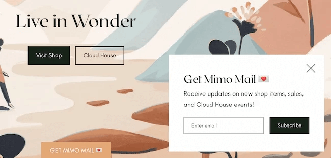
The minimalistic design and the way the popup hasn’t taken up the whole space is exactly why your customer would love to subscribe to your newsletter.
Aim to keep the design clutter-free to draw attention like this exit intent popup example had done here. Also, did you notice that the popup here is only made of black and white and still looks striking?
2. Discount exit popup example
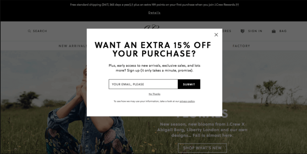
J Crew exit intent popup example used a great strategy here – asking for their email address by offering a 15% discount. Also, it’s a lightbox exit intent popup that blurs out everything else.
This type of popup can be a little annoying, but the “no thanks” button cancels it out.
Related Reading: Learn how to offer compelling discounts in popups in our blog: Discount Popup: 12 Examples + How to Create
3. Offering help exit intent popup example
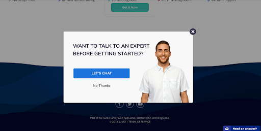
There is a chance that your customer needs help with something, and when you politely ask them through an exit intent popup, they might stick around.
Just make sure you always add a “no thanks” button like this best exit intent popup example to look non-intrusive.
4. Collecting demographics exit intent popup example
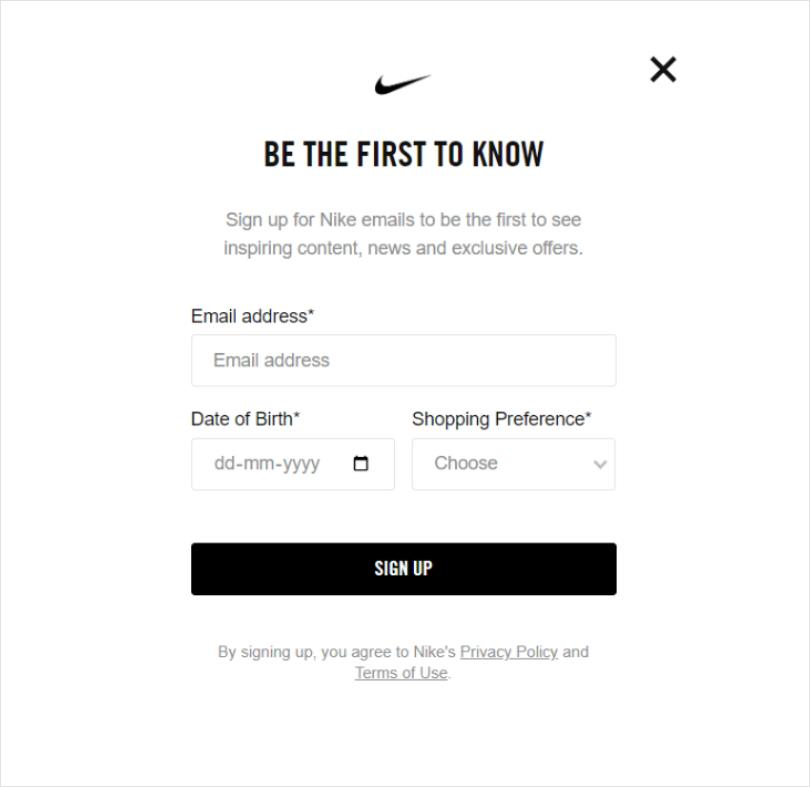
There isn’t much to talk about design or colors here. It’s the straightforward content and fields that have stolen the show in this best exit intent popup template.
Asking for their email, date of birth, and shopping preferences is Nike’s way of giving their customers a personalized experience. The exit button at the right corner is worth the mention.
5. Countdown timer exit intent popup example
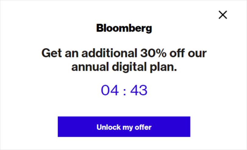
There is no better way to induce a sense of urgency than a countdown timer.
This best exit intent popup example has promised a 30% discount on their annual digital plan, but the offer only lasts a few minutes. This kind of pressure sure does work well to slash the price of the annual plan or any pricing plan.
6. Sign-up exit intent popup
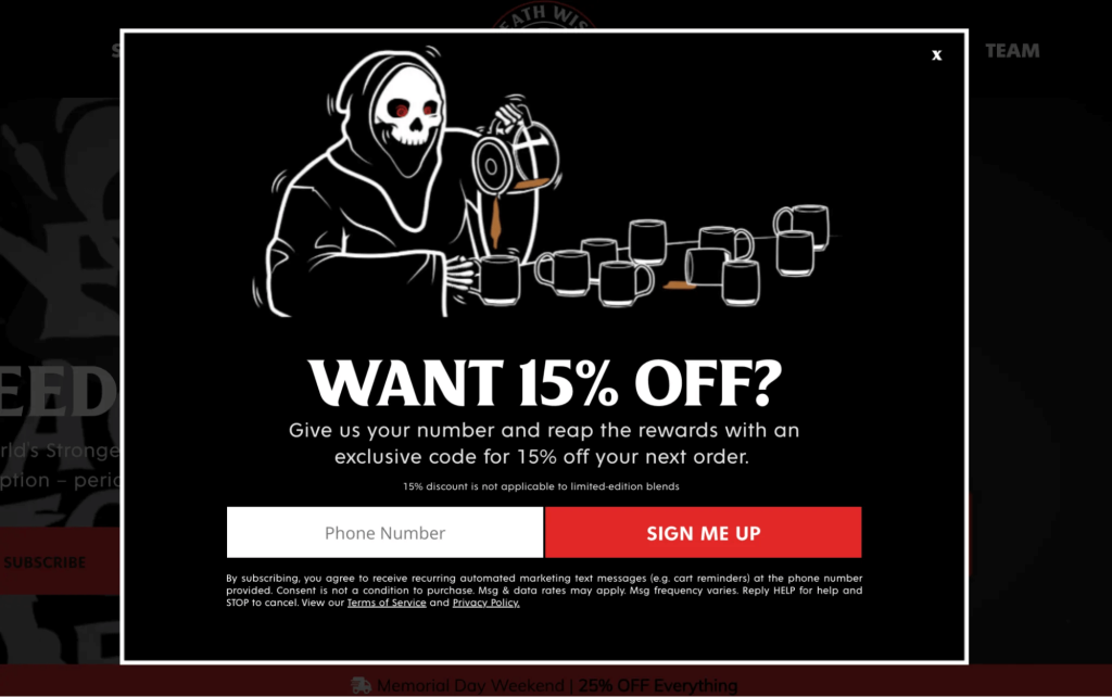
If your guest user is leaving without signing up, you could always ask them to sign up with an exit intent popup. Death Wish Coffee has offered 15% off if the user signs up using their phone number.
The whole design oozes brand personality, and the sign-me-up button looks bright against the background to catch attention.
Related Reading: Learn how to increase sign-up with popups in our blog: 12 Best Newsletter Signup Form Examples to Grow Your Email List
7. Discount code exit intent popup example
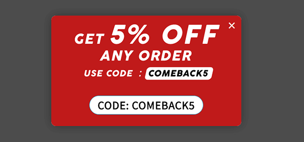
This best exit popup template from Skates.co.uk is automated to show up when the cart is left inactive for a few seconds. In most cart abandonment cases, a simple discount could get a lot of conversions.
Just time the popup right to catch their attention using a trigger-based exit intent popup plugin.
8. Feedback request exit intent popup example
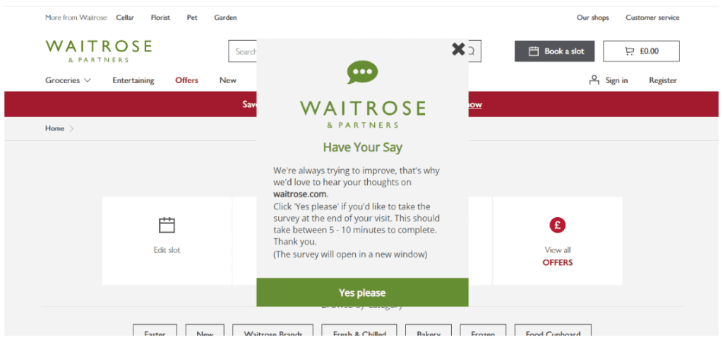
Exit intent popups are an excellent way of asking for feedback, and Waitrose has done it well. The thoughtful message sounding considerate with wanting to hear their feedback is tempting to click on the CTA.
9. Cart abandonment exit intent popup example
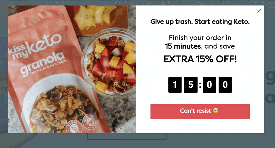
Kiss My Keto has made a bold move in their best exit intent popup by using their brand statement to show up when someone abandons their cart: “Give up trash. Start eating Keto.” Their way of promoting their brand is using health-promoting statements. Also, the timer and the cute CTA are brilliant moves to reduce cart abandonment.
Create exit intent popups using Retainful and offer incentives to reduce abandoned cart rates.
10. Free shipping exit intent popup example
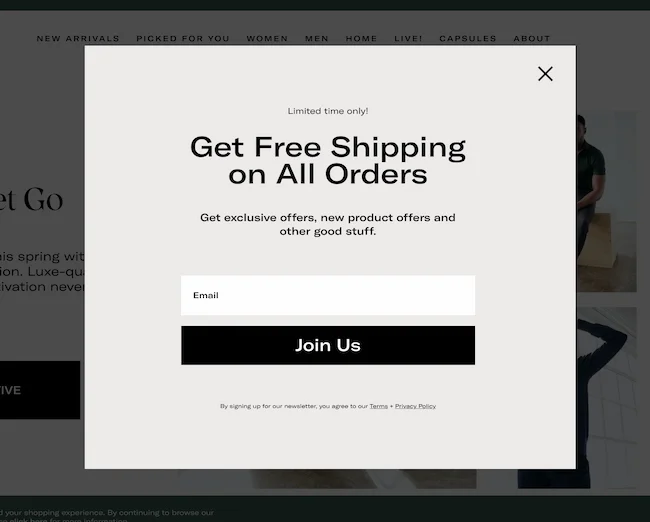
Giving offers is one thing, but another equally tempting way of capturing customer’s email addresses is by offering free shipping. This example of an exit intent popup from Quince has played it right – a lightbox popup, a minimalistic design, and a clear exit button
11. Free guide exit intent popup example
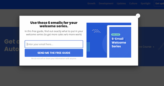
Exit popups work only if you have something valuable to offer. Take this best exit popup as an example. ActiveCampaign has provided a free guide on how to send a welcome email series. This is helpful and free, and honestly, who could resist entering their email address in that text box?
12. Product demo exit popup example
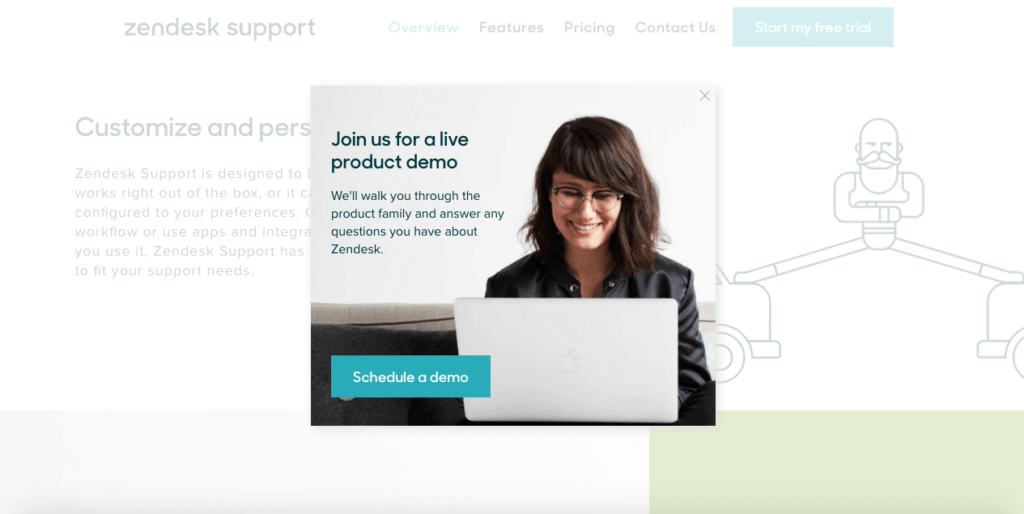
Zendesk has the best exit popup example because it is triggered to show up when the customer shows exit intent after checking the price. The popup offers to give a free demo to customers and answer any queries they might have. The exit icon at the right corner makes this lightbox popup less intrusive.
13. First-purchase offer exit intent popup
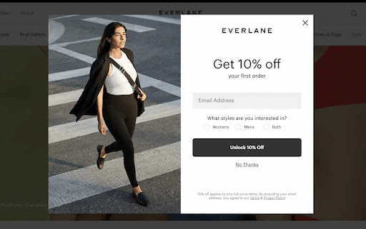
Everlane’s exit intent popup template is minimal, aesthetic, and strategic. It offers 10% off for their first order in exchange for their email address and style preferences to customize their experience. It is a simple and effective way to capture attention and turn it into conversion.
14. Exit intent popup showing a warm message
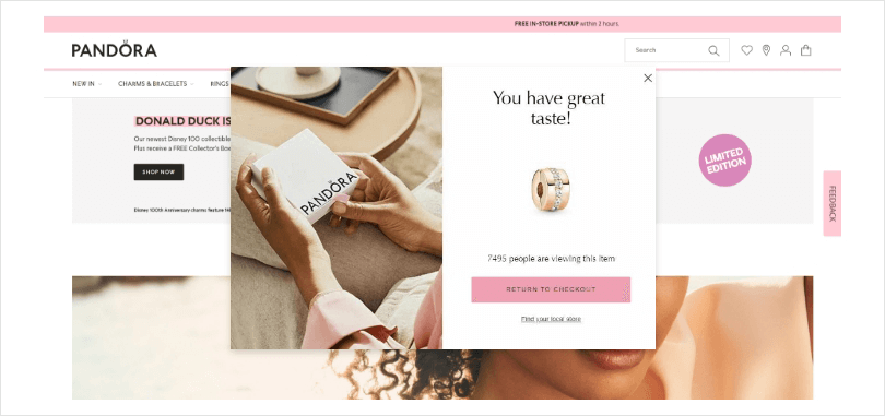
Imagine an exit popup showing up with a sweet message that says you’ve got great taste. Of course, you’d start liking that brand immediately and might even consider buying it.
Pandora has used a real-time statistic of how many people are currently viewing that product for the urgency factor, and it is enough pressure for the customer to consider buying.
15. GIF exit intent popup example
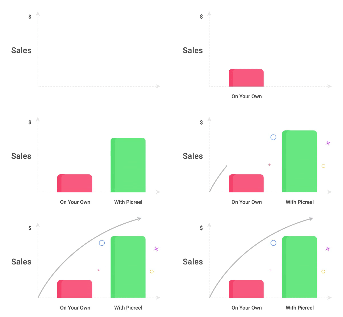
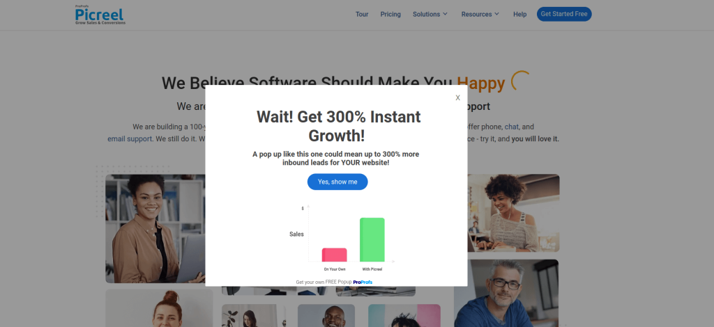
Picreel has gone even further to catch attention with a GIF in an exit intent popup.
A visual representation of what their exit intent popup can do for your brand is very persuasive and helps you reconsider exiting the website.
16. Freemium exit intent popup
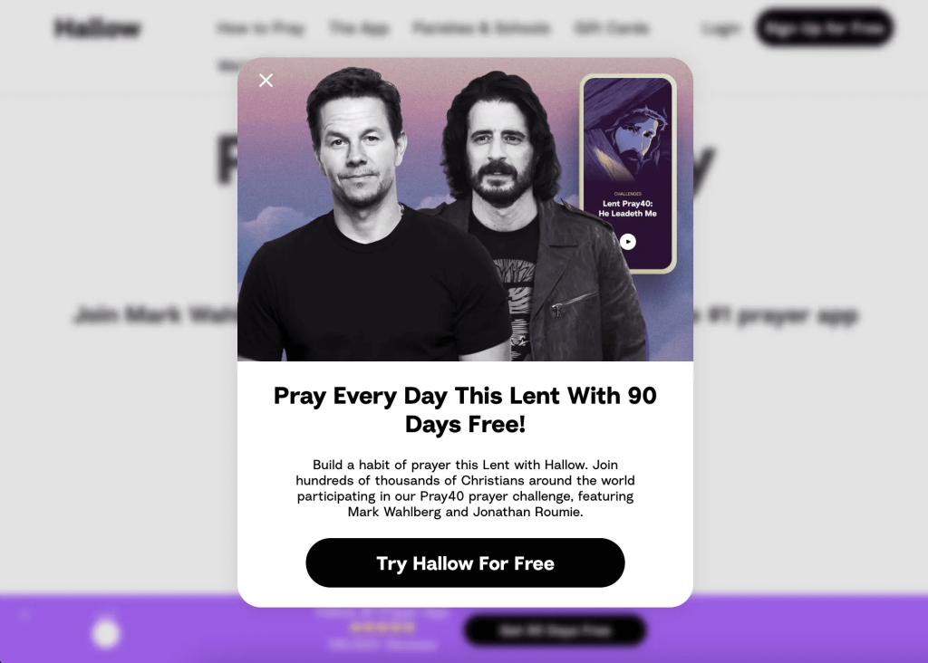
Hallow has the best exit intent popup example because it states everything clearly, has an exit button, strategically places its influencers on the exit intent popup, advocates building a prayer habit, and has ended with a freemium plan CTA. This has driven thousands of conversions.
17. Social proof exit popup example
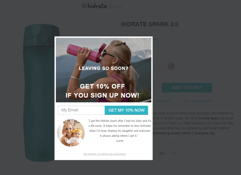
Hesitant customers could leave the website and your best shot to convince them is by using social proof. But Hidrake Spark has included a discount as well which is a brilliant move to persuade the customers who might be skeptical about purchasing.
18. Spin the wheel exit popup example
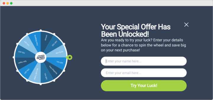
Portraitflip’s example of an exit intent popup has a spin-the-wheel concept.
Gamified things usually have a way of capturing the customer’s attention and when incorporated with exit intent popup, it definitely increases conversion.
19. Valuable content exit popup example
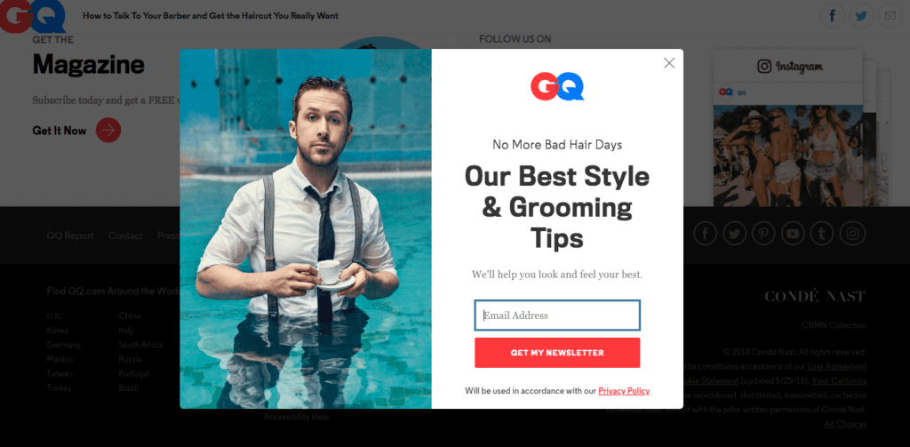
GQ is dangling their grooming tips newsletter with this exit intent popup example. Valuable content will always be worshipped, and when paired with an exit intent popup, it will definitely have weight with its target audience.
20. Save my cart exit intent pop-up example
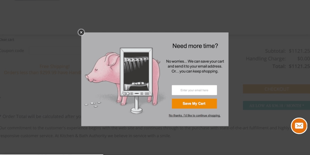
This considerate example from KBauthority asks if the customer needs more time. This is a good idea if you want to get the guest user’s email addresses, build an email list, and even retain customers.
Related Reading: Get To Know How An Add To Cart Popup Can Help You Boost WooCommerce Sales.
Exit intent popup best practices
Don’t overwhelm yourself with too many details. Stick to a strict regimen of best practices and customize it for your brand aesthetic. Here are a few exit intent popup best practices to help you design the best exit intent popup.
- Target your audience: Craft the popup message specifically for the audience segment leaving the site.
- Compelling offer: Make an irresistible offer that solves a problem or provides value.
- Clear and concise copy: Use strong headlines and short, easy-to-read text.
- Mobile-friendly design: Ensure the popup looks good and functions well on all devices.
- Fast loading: Popups should appear instantly to capture attention before visitors leave.
- Simple design: Avoid clutter and focus on a clear message with minimal elements.
- Strong call to action (CTA): Tell visitors exactly what you want them to do with a clear and compelling CTA button.
- Consider exit intent triggers: Experiment with different triggers beyond just cursor movement, like time on the page or scroll depth.
- A/B test variations: Test different versions of your popup to see what resonates best with your audience.
- Easy opt-out: Include a clear and easy way for users to close the popup and avoid future ones.
Launch exit intent popups using Retainful now and increase conversions effortlessly.
Wrapping up
So, you’ve seen how exit intent popups can recapture website visitors and convert them into valuable leads or customers. By leveraging strategic design, targeted messaging, and irresistible offers, you can turn those departing clicks into positive interactions.
Remember, the key to success lies in following exit-intent popup best practices. Craft a user-friendly experience with clear value propositions and a focus on building trust.
Ready to implement exit intent popups on your website? With a little creativity and these valuable tips, you can watch your conversion rates soar.
Read next:
Frequently Asked Questions
Imagine browsing a shoe store website. As you move your cursor toward the top of the page to leave, a window pops up offering a discount on your next purchase. That’s an exit-intent popup.
The mouse movement triggers exit-intent popups. Exit intent popup should trigger when the cursor moves toward the top of the browser window or browser tabs, indicating that a customer might be leaving the site.
You typically won’t code exit-intent popups yourself. Most email marketing platforms and website-building tools offer pre-built features or plugins for creating and implementing them.
They can be good or bad! Well-designed exit-intent popups with valuable offers can be a great way to capture leads. However, intrusive popups can annoy visitors. The key is to find the right balance.

