Newsletter signup examples showcase the strategy behind capturing attention and turning casual browsers into engaged subscribers.
Each example tells a story of how a simple newsletter signup form can make a website vistor subcriber to a newsletter. Whether it’s through clever wording, a good incentive, or compelling design, the right approach can make all the difference.
To nail this conversion tool, we will explore 12 great email newsletter signup form examples and see how popular brands and content creators not only grow their email lists but also enhance the overall customer experience.
Let’s dive right in.
Create smart popups with Retainful that are triggered based on visitor behavior and convert casual visitors to subscribers.
Essential Elements of Newsletter Signup Forms
A newsletter signup form should turn website visitors into subscribers and grow your email list by grabbing attention, conveying value, and simplifying the sign-up process.
Here are the essential elements of email signup forms.
- Compelling headline
- Value proposition
- A strong CTA
- Minimal fields
- Strategic timing
Let’s see these elements to include in email signup forms in detail.
1. Compelling headline
Your headline is the hook. It should instantly capture attention and clearly articulate the benefit of subscribing to the email newsletter signup form.
Other than saying ‘Subscribe to your newsletter’, make your headline speaks aboout access to exclusive content, discounts, or insider news, and other interests of your target audience.
Here are some alternatives to ‘Subsribe to our newsletter’ wording:
- Get exclusive tips and offers straight to your inbox
- Join our community for insider updates and deals
- Join 1 lakh+ product marketers learning about GTM
2. Value proposition
The email signup form should clearly communicate the value of subscribing and what they get in return.
Whether it’s exclusive offers, free downloads, or valuable insights, your newsletter subscription form should make the case for why joining your newsletter is a no-brainer.
In your popups, the more specific and relevant the offer, the better.
3. A strong CTA
Your CTA button is where the conversion happens in your email newsletter signup form.
Make it visually prominent and use compelling text that inspires action, like “Get My Discount” or “Join the Club.” The CTA should make the next step obvious and enticing.
4. Minimal fields
Simplify the sign-up process by asking for only essential information – usually just an email address in your newsletter signup form.
Each additional field can decrease the likelihood of completion. The quicker and easier it is to sign up, the higher your conversion rate will be.
5. Strategic timing
The timing of your email newsletter signups can make or break its success.
Utilize exit-intent popups to catch visitors who are about to leave or set a timer to display the newsletter subscription form after someone has been engaged with your content for a specific duration.
12 Best Newsletter Signup Examples
The 12 best newsletter signup examples are:
- Founder OS – Targeted Value Proposition
- Wix – Content Promotion
- Elvie and Leo – Converting visitors to buyers
- PCMag – Compelling incentives
- Tim Ferris – FOMO and social proof
- Farnam Street – Clear value proposition
- Woven Store – Immediate incentive
- Casper – Extended Benefits
- Backlinko – Building Credibility
- Shinesty – Setting the tone
- David Perell – Curated content
- Primal pet foods – Collecting data to personalize
Let’s break down these great email newsletter signup form examples and see what makes them high-converting.
1. Founder OS
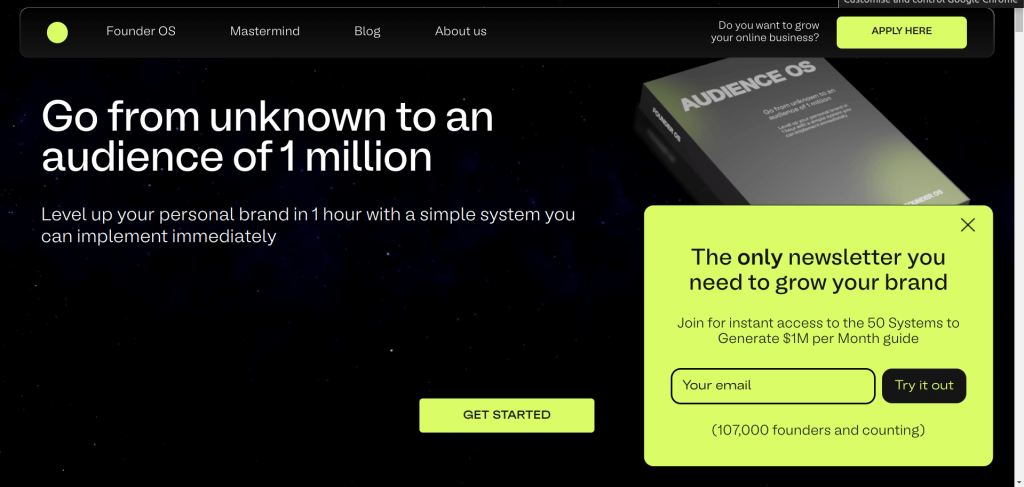
This newsletter signup popup example follows a perfect structure – Targeted value proposition -> Incentive -> Email capture -> Social proof.
You could follow the same in your email list signup form.
What makes this great email newsletter signup example stand out?
- Capturing the attention of the target audience: Instead of a generic “Join our email list” newsletter message, this newsletter signup form example positions itself as a unique, must-have resource, differentiating it from the myriad of generic marketing content online.
- Strategic placement: Placing the newsletter subscription form on the side rather than at the center ensures it is noticeable without being annoying. It allows visitors to continue engaging with site content while the offer remains accessible.
- Trust element: Including the footer text “100000 founders and counting” can significantly increase trust and perceived value, motivating others to join in hopes of replicating others’ success.
2. Ahrefs
Focus: A clear ‘Why’

What we like in this newsletter sign form example?
Ahrefs’ Digest newsletter signup is a masterclass in email acquisition. Here’s why it works so well:
- Immediate Value: “Get our free weekly newsletter” – no confusion here. It’s direct, clear, and promises value upfront. No beating around the bush.
- Social Proof: “Read by 284K SEOs and marketers.” That’s huge. It tells potential subscribers, “Hey, you’re in good company.” You instantly trust something with that many fans.
- Bullet Points: News, reads, blog posts, and memes. It’s a perfect blend of educational content and fun.
- Big Bold CTA: “The “Subscribe” button stands out in orange, making it clear where to click.
3. Feastables

Why is this a good newsletter signup example?
- Strong Personality and Trust: The tagline immediately taps into MrBeast’s iconic persona. His massive following makes this instantly trustable, and people want to be part of something he’s behind.
- No wall of text: This form keeps it straightforward. There’s no fluff. You’re not bombarded with tons of text. Just a fun, bold call to action and one simple ask: your email. That’s it. This reduces friction and encourages action.
4. Olipop
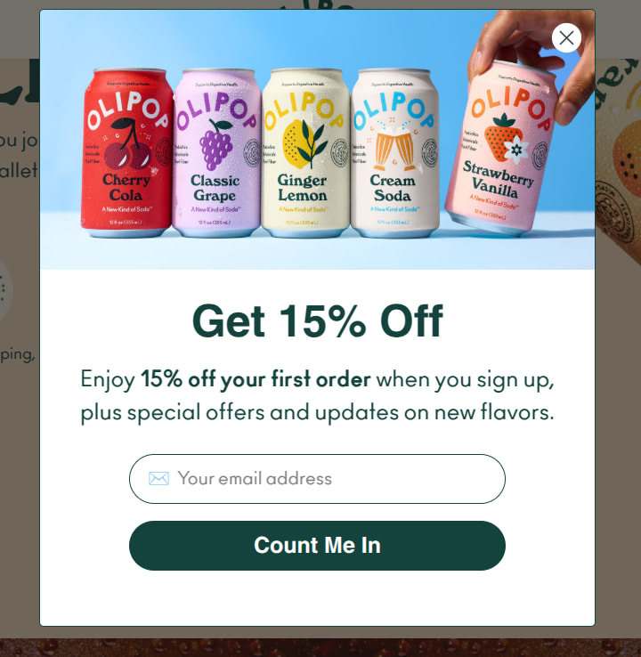
Why is this good ecommerce newsletter subscription form?
- Clean Design = No Mental Fatigue: Minimalist layout. Generous spacing. Single field. It doesn’t make you think.
- The Product Front and Center: The cans. The color. The vibe. You instantly know what you’re signing up for in the newsletter. It’s playful, flavorful, and feels premium. That visual sells the experience, not just the product.
- Clear, Tangible Value: “Get 15% Off.” Straight to the point. No fancy copywriting. No vague promises. Just instant gratification for your email. And let’s be honest – a discount is still one of the most effective list builders around.
5. Glossier
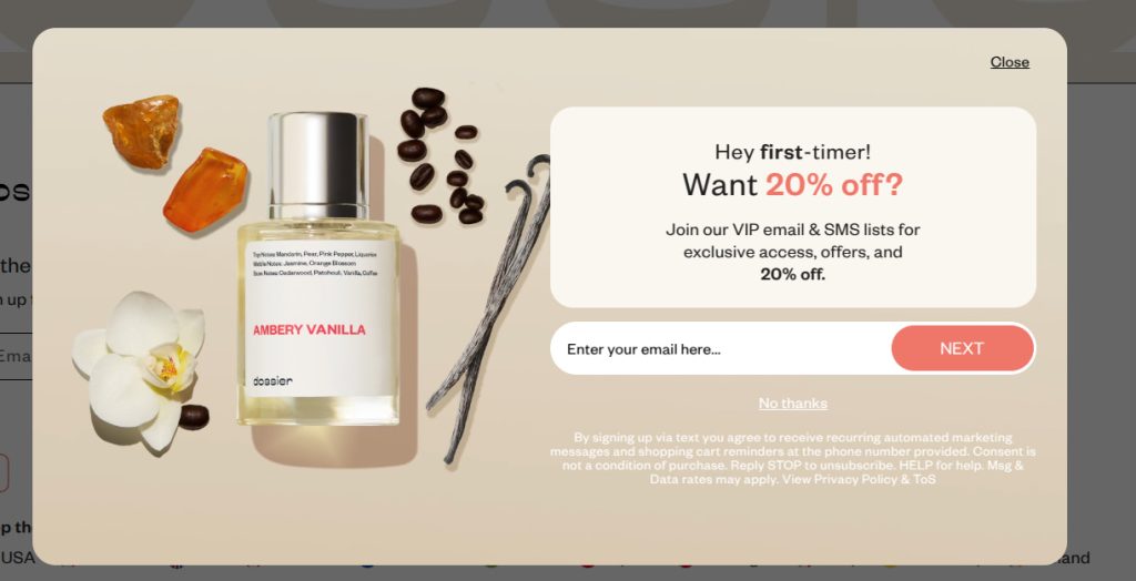
Why is this a good newsletter subscription example?
- The Power of ‘First-Timer’ Appeal: There’s no better way to grab attention than calling out the audience directly. This type of tagline is better than generic “Join our list to get 10% off” message. It immediately speaks to newcomers, making them feel like they’re being treated to a special deal.
- Exclusive access: This newsletter signup form example isn’t just about the discount. It’s about belonging. “VIP” and “exclusive” are powerful words that elevate the value of the offer. It promises more than a typical promo; it offers insider status.
6. Elvie and Leo
Focus: Converting visitors to buyers
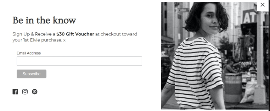
In this email newsletter signup form example, the tagline “Be in the Know” taps into the natural human curiosity and desire not to miss out on important information or opportunities.
It positions the newsletter as a gateway to exclusive knowledge, insider updates, or early access to deals, making it appealing for users who want to stay ahead of the curve.
What makes this email newsletter signup example stand out?
- Strong incentive
Offering a $30 gift voucher not only provides a direct financial benefit but also serves as a strong incentive to encourage sign-ups. - Converting potential customers
By focusing on new subscribers who are yet to make their first purchase, this newsletter signup form example specifically targets new visitors or potential customers. It’s an excellent email marketing strategy to convert first-time visitors into buyers, increasing the chances that they will engage more deeply with the brand.
7. PCMag
Focus: Compelling incentives
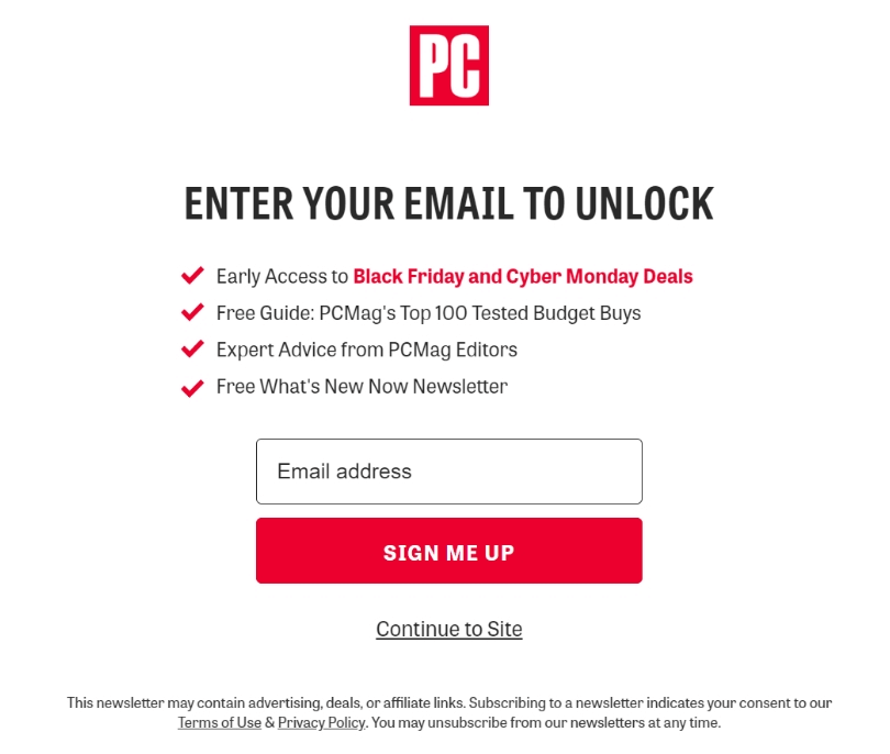
This PCMag newsletter signup popup example is effective because it clearly communicates what subscribers will gain in exchange for their email addresses.
The variety of values offered in this email signup form example not only captures the attention of diverse visitors but also promises ongoing value, making it a compelling choice for many.
What makes this email newsletter signup example stand out?
- Valuable incentives
The newsletter signup message promises several valuable incentives for signing up. This makes it irresistible for the viewers to sign up. - Targeted appeal
The combination of early sale access, expert advice, and free resources targets a broad yet interested audience. It appeals to tech enthusiasts, savvy shoppers, and information seekers alike, making the newsletter subscription message relevant to a wide demographic.
8. Tim Ferris
Focus: FOMO and social proof

The tagline in this newsletter signup form example taps into a fear of missing out (FOMO). It creates a sense of exclusivity and urgency, suggesting that subscribers will gain access to unique insights and discoveries that they can’t find elsewhere.
What makes this newsletter signup example stand out?
- Clear and concise offer
This email newsletter signup form communicates the offer succinctly: “Join 1.5M+ subscribers and sign up for 5-Bullet Friday.” This clarity ensures that potential subscribers immediately understand what they are signing up for – a weekly email with five curated items. - Social proof
Mentioning that over 1.5 million subscribers are already receiving the newsletter serves as a powerful form of social proof. It reassures potential subscribers that they are joining a large group of like-minded individuals who find value in Ferriss’s content.
Related Reading: What emails to send after a sign up to confirm the subscription and welcome subscribers? Learn here:
7 Best Double Opt-in Email Examples + Best Practices
Welcome Email Series – Examples + How to Create
9. Farnam Street
Focus: Clear value proposition
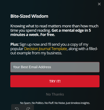
Farnam Street’s email newsletter signup form example is known for its focus on improving mental models and critical thinking. The newsletter signup message also emphasizes the benefit of providing them with immediate tools for personal and professional growth.
What makes this newsletter signup form example stand out?
- Value proposition
The main headline, “Get a mental edge in 5 minutes a week for free” directly appeals to potential subscribers by promising a significant benefit – enhanced mental sharpness – with a minimal time commitment.
The addition of “for free” emphasizes the no-cost aspect, making the offer even more attractive. - Relevance and utility
The Decision Journal Template is a particularly strategic choice of incentive for Farnam Street’s audience, who are typically engaged in continuous learning and improvement in thinking and decision-making processes.
Design attention-grabbing popups effortlessly with Retainful’s drag-and-drop email editor and pre-designed templates.
10. Woven Store
Focus: Immediate incentive
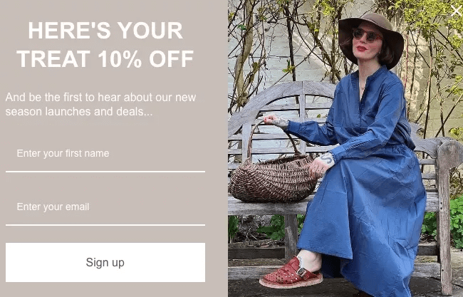
The Woven Store email example of newsletter signup form is designed to maximize conversions by offering immediate discounts and exclusive access to information.
This discount popup for newsletter signup not only attracts a wide array of customers but also sets the stage for the first purchase.
What makes this great email list signup example stand out?
- Immediate Incentive
The offer of “10% off” serves as an immediate reward for signing up and provides a tangible benefit right from the outset. - Exclusive Information
By promising that subscribers will be the first ones to hear about their new season launch and deals, the email newsletter signup taps into the desire for exclusivity and insider information.
Customers value early access to new products and special deals, enhancing their sense of VIP status.
11. Casper
Focus: Extended Benefits
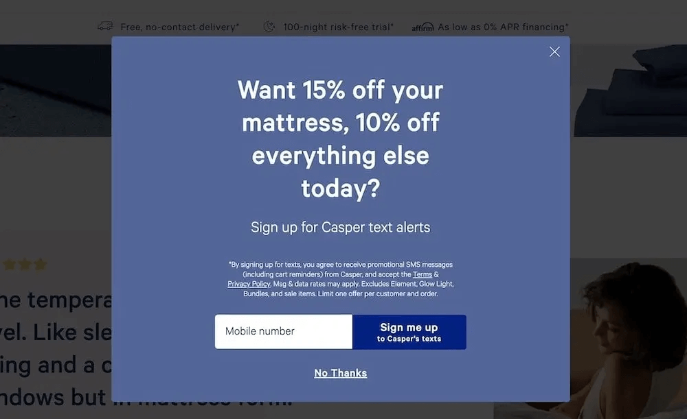
Casper’s newsletter signup popup example effectively uses direct incentives to drive sign-ups and sales.
By combining a clear, value-packed proposition with a straightforward call to action, this email newsletter subscription form is poised to grow its customer base and maintain long-term engagement.
What makes this example of newsletter signup form stand out?
- Immediate and extended benefits
The immediate discount on a mattress offers a strong lure to subscribe now, while the additional discount on other items encourages future purchases. This combination ensures that the benefits extend beyond a single transaction and increases the lifetime value of each subscriber.
12. Backlinko
Focus: Building credibility
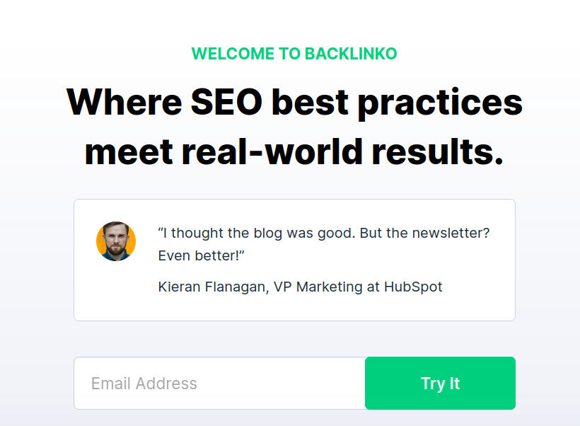
This Backlinko newsletter signup example effectively leverages a clear value proposition and user-friendly design to convert subscribers who are looking for advanced SEO strategies that yield real results.
This targeted approach ensures that this email newsletter signup form appeals to a dedicated and relevant audience, setting the stage for high engagement rates and strong subscriber retention.
What makes this example of newsletter signup form stand out?
- Clear and Engaging Value Proposition
The introduction “Welcome to Backlinko – Where SEO best practices meet real-world results” immediately clarifies the value of subscribing. It promises practical, actionable SEO insights that directly lead to measurable outcomes. - Authority and credibility
Including a review from the VP of HubSpot, a respected authority in the marketing world, significantly increases the credibility of the newsletter.
Testimonials from industry leaders not only validate the quality and relevance of the content but also position the Backlinko newsletter as a trusted resource in the crowded SEO learning space. - Targeted audience appeal
In the email newsletter signup example, the specific mention of “best practices” and “real-world results” caters to an audience that is tired of generic advice and seeks proven strategies.
Related Reading: Want more examples email popups for capturing email addresses? Check out our blog: 15 Email Popup Examples And Best Practices To Build Email List
13. Shinesty
Focus: Setting the tone
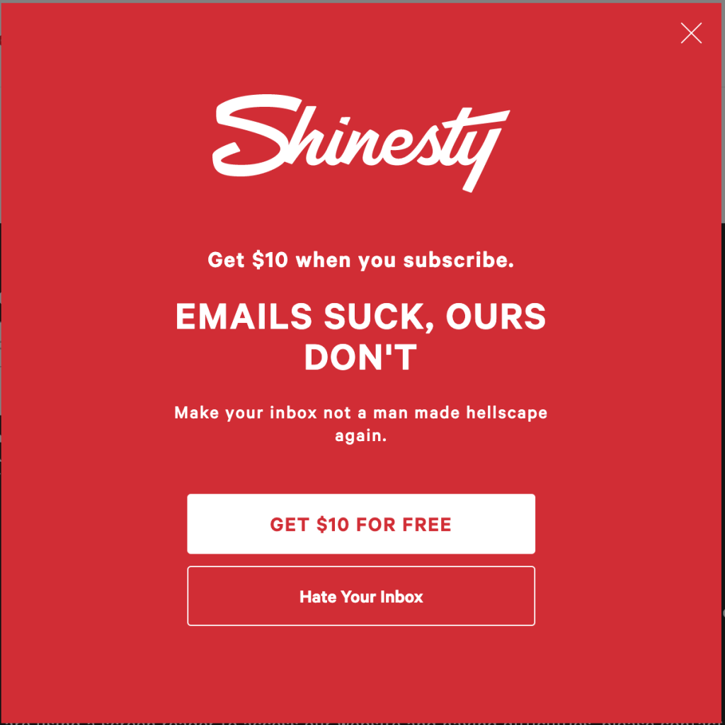
In your email newsletter signup example, showing a tinge of what the tone of your emails will be, what customers can expect from your emails – is it going to be funny and unconventional or informative?
What makes this newsletter subscription example stand out?
- Humorous tone
Using humor in this email newsletter signup example makes the brand feel more human and relatable. This not only captures attention but also sets the tone for what subscribers can expect in their newsletters – content that is likely fun, engaging, and different from the norm. - Strong Call-to-Action
The CTA “Get $10 for free” is direct and appealing, emphasizing the freebie subscribers will receive.
14. David Perell
Focus: Curated content
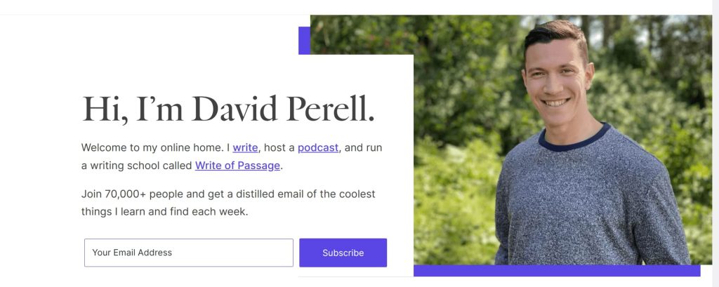
David Perell’s newsletter signup popup example is crafted to resonate deeply with a broad audience. It combines a personal touch, the promise of exclusive insights, and the effective use of social proof.
What makes this email newsletter signup example stand out?
- Diverse content offering
By mentioning his activities – writing, hosting a podcast, and running a writing school, this great email list signup form example showcases the breadth of content subscribers can expect.
This would appeal to a wide audience, from aspiring writers to podcast enthusiasts, increasing the chances of subscriptions from people with various interests. - Exclusive and curated content
The offer in the example of a newsletter signup to receive exclusive insights curated by David himself not only highlights the value of the newsletter but also positions it as a must-have resource for those eager to learn and gain new perspectives weekly.
15. Primal pet foods
Focus: Collecting data to personalize
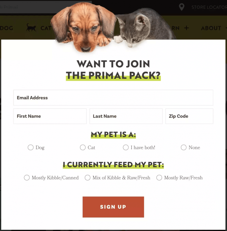
The information collected using a newsletter signup form allows you to segment your subscribers and send content curated for each segment. This way, your content resonates with subscribers more and increases conversions.
This great newsletter signup example does exactly that – their content and promotions can be customized based on the pet type or dietary preferences.
What makes this newsletter signup message stand out?
- Personalized interaction
By asking for details such as the first name, zip code, type of pet, and what they currently feed their pet, Primal Pet Foods can tailor their communications to the specific needs and interests of each subscriber.
Related Reading: Explore the best email list building tools to grow your email list in our blog: The 11 Best Email List Building Tools To Increase Conversions
How to create newsletter signup forms?
To create newsletter signup forms, you have to use a standalone list-building tool or email marketing software.
Retainful is an all-in-one email marketing software that allows you to launch automated email campaigns effortlessly with easy-to-setup email automation.
Along with that, it also offers smart pop-ups/signup forms to grow your email list by successfully capturing the email addresses of visitors in your e-commerce store.
Retainful allows you to create targeted newsletter signup forms using:
- Precise targeting: Geolocation, time spent on a page, language, and more.
- Triggers: Exit-intent, scroll depth, add-to-cart, and more
You can choose a newsletter popup template from a variety of pre-designed ones and customize them to match your branding.
These email newsletter signup forms are triggered automatically based on visitor behavior and can be targeted to a specific group of customers.
Here are the steps to create email newsletter signup forms in Retainful.
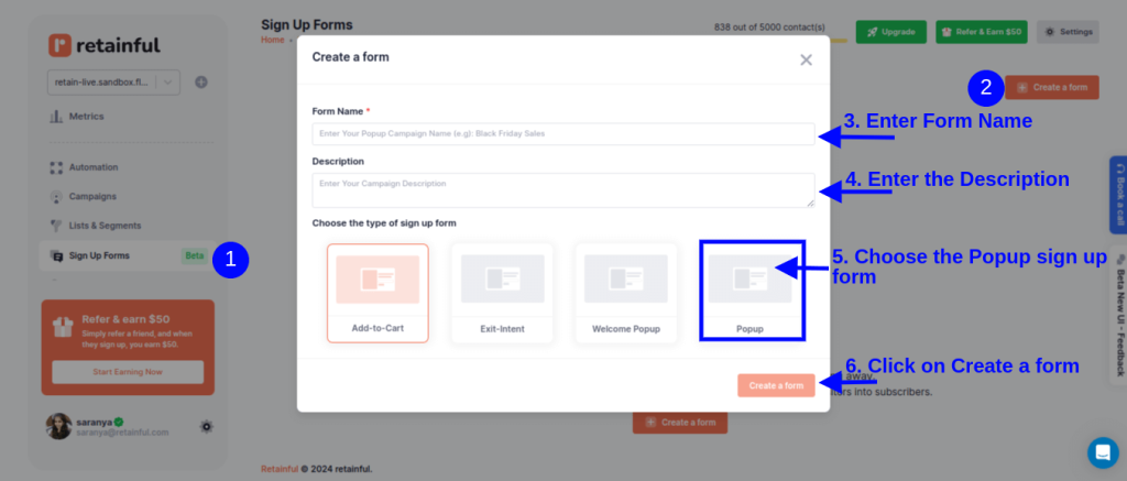
Step 1: Choose the type of popup/sign-up form
Login to your Retainful dashboard. Go to Sign-up Forms, choose ‘Popup’ and click on ‘Create a Form.’
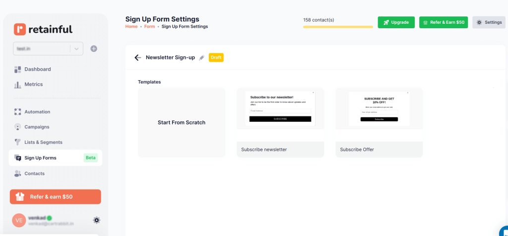
Step 2: Choose the newsletter signup form template
Retainful has many pre-designed email newsletter signup templates to choose from or you can create your own from scratch.
Step 3: Customize the newsletter signup form template
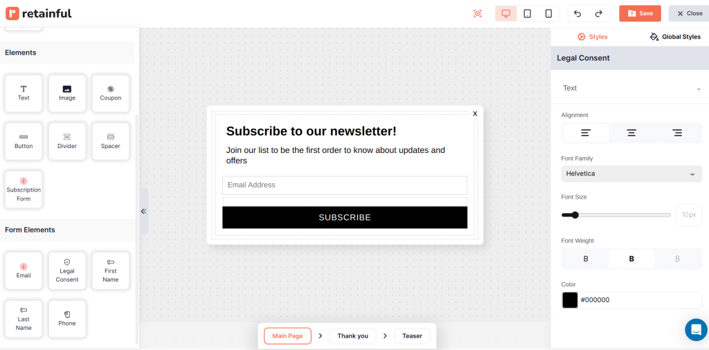
Retainful’s drag-and-drop editor offers a range of customizable blocks such as text, images, CTAs, and more.
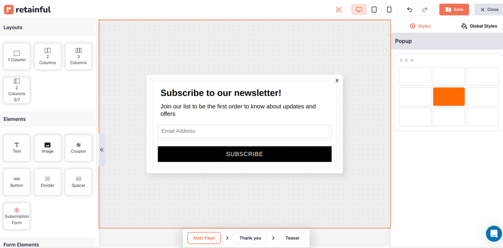
You can add more elements to your newsletter popup, like First name, last name, phone number and legal consent.
Step 4: Choose who should receive the popup
You can target the mailing list signup form to a specific group of customers.
You can add an existing customer segment or create a new empty segment from ‘List and Segments’ for new users using Retainful’s segmentation feature.
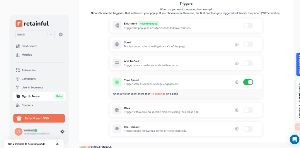
Step 5: Set up the trigger and targeting
Choose the trigger to determine when you want to show the email newsletter signup form.
In this case, let’s choose ‘Time Based’.
You can also select multiple triggers to make your newsletter subscription form more tuned to the visitor’s behavior.
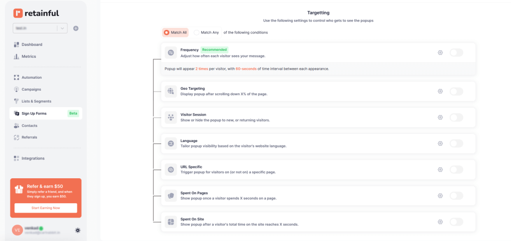
In the targeting, choose who should see your newsletter signup form. For example, you can show a popup based on the location they are on.
Step 6: Enable the newsletter sign form
After confirming your settings, enable the pop-up. Your signup form will be set live.
Create free email sign up forms and increase conversion rate with Retainful.
Display popups at the right time to the right people with Retainful and increase conversions.
Wrapping up!!
The newsletter signup examples we’ve explored in this blog underscore the significance of crafting thoughtful and engaging newsletter signup forms.
Each example serves as a blueprint for how effectively combining creativity and personalization can convert simple email signup forms into a tool for converting customers.
Whether it’s through exclusive content, incentives, or social proof, a well-designed newsletter subscription form is your first step toward turning casual visitors into loyal subscribers.
Also Read:
- How to add a Newsletter Popup in Shopify?
- WooCommerce Popup: How to Create [+Top Plugin]
- 10 Best WordPress Popup Plugins
Frequently Asked Questions
Yes, you can add a newsletter popup to your website using popup builder tools like Retainful that integrate with your site.
Create a mailing list signup form by using email marketing software to design a signup form, then embed it on your website. Offer incentives like discounts or free content to encourage signups.
Place the signup form prominently on your website’s homepage, blog page, and footer. Consider also using pop-ups or slide-ins for increased visibility without being intrusive.
To create a mailing list sign up form:
Step 1: Choose an email marketing platform and install it.
Step 2: Choose the type of popup
Step 3: Customize the signup form template
Step 4: Setup triggers and targeting
Step 5: Go live
A signup form should have a compelling headline, a brief value statement (why sign up?), essential fields (name, email), a CTA button, social proof and a privacy statement.
To create an email signup form:
Step 1: Choose an email marketing platform -> install it -> Go to signup forms section
Step 2: Choose the type of popup
Step 3: Customize the signup form template
Step 4: Setup triggers and targeting
Step 5: Go live
Offer an incentive like a discount, freebie, or exclusive content. Place sign-up forms on high-traffic areas (homepage, checkout, blog). Use popups, exit intent forms, and social media promotions to capture more subscribers.
Write a newsletter signup copy that highlights benefits, use an engaging headline, CTA (“Join Now”), and social proof to build trust and increase signups.

