Building a highly converting eCommerce landing page can be complex if you don’t follow some eCommerce landing page ideas.
Landing pages give you the first chance to persuade your visitors to perform a vital action. So, designing something ‘good’ is not enough, you need to do something better than that.
You should find out what your customers want before you start designing, only then you can build high converting landing pages.
We crafted this article to show you the eCommerce landing page best practices along with a few eCommerce landing page tips to build high-converting landing pages along with the best eCommerce landing page examples.
Boost your e-commerce sales today with Retainful! Sign up now to recover abandoned carts, offer post-purchase upsells, and increase customer loyalty.
What is Ecommerce landing page?
A landing page is a webpage designed specifically for persuading a customer to perform an action on the offer. Generally, eCommerce landing pages aren’t designed to provide services rather they’re designed to sell products.
The eCommerce landing page uses elements such as social proof, trust metrics, tailored conversion ratios, magnetic headlines, and others to encourage visitors to press the CTA button.
Why you need landing page for eCommerce store?
Once you’ve created your website, you’ll be looking to boost your sales and for that, you need a dynamic conversion medium, that’s where a high converting eCommerce landing page comes into play.
Landing pages are special pages with special content that focus solely on marketing a product.
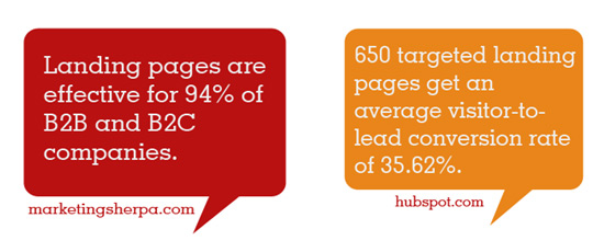
It serves as a great platform to attract traffic, enhance SEO, and boost your awareness.
A recent study shows that around 44% of B2B businesses use landing pages to elevate their conversions and 48% of marketers build high converting eCommerce landing pages for each campaign.
Here are a few things on why you need a landing page for eCommerce store,
- To make a good first impression.
- It can visually attract a customer through videos and images.
- Landing pages can foster trust by showing trust badges.
- Increases your conversion rates through dynamic CTAs.
- To get ranked higher on search engines using SEO.
- To convert visitors into subscribers efficiently.
Essential components of a eCommerce landing page
Landing pages generally have a 15% conversion rate on average but are widely eclipsed by the homepage and product page.
Now, let’s take a look at some of the essential components of an eCommerce landing page.
Headline – Never sacrifice your quality on this one. Your heading should reflect whatever your landing page is representing, If it is linked to your email campaign then your headline should reflect the email campaign.
Images – An attractive image that exposes what the page is about, it can represent the page’s motive or directly a picture of the product. It should be clearly visible and large.
Dynamic Call to action – What use is a landing page without a CTA button. It should be attractive and it must have the responsibility of motivating a customer to subscribe, sign up, or any conversion activity.
Trust badges – A landing page should foster trust and loyalty, the only way you can do is by showcasing your social proof, trust badges, or testimonials to make customers feel safe.
Intuitive form – This is the most crucial component of a landing page. A form to capture customer information, it is should be intuitive, friendly, and not intimidating.
These are some major components of a landing page and now let’s get into detail on how to build high converting eCommerce landing pages examples.
Ecommerce landing page best practices
Ecommerce landing page optimization is a hard-to-skip tactic that needs to be performed from time to time by eCommerce stores if they want to get a better rank or SERP and increase their traffic.
But what stands in the way towards achieving eCommerce landing optimization is that not many store owners actually know how to do it. So, to help you out we have listed some of the eCommerce landing page best practices and some eCommerce landing page tips that can help you build highly converting pages easily.
So, without further ado, let us dive into the 10 eCommerce landing page best practices in the following sections,
Build an effective design
The first of many eCommerce landing page tips is the design. When it comes to building the high-converting eCommerce landing page, you have to hit the bullseye with design. Building a unique design is one of the eCommerce landing page best practices.
A well-designed page will have an aesthetic appeal to it and it will contribute to better conversions.
How can I give an aesthetic appeal to a landing page?
- Keep the design minimalistic.
- Use images, but don’t overcrowd it.
- Don’t give away too much information.
- Optimize your page with white spaces.
- Use eye-catchy colors to highlight your motive.
- Add an appealing Call to action.
- Use bullet points for easy scanning.
- Showcase only the key information.
- Keep it conversion-oriented.
- The colors should match your brand for easy recognition.
The above-mentioned points are some of the best eCommerce landing page ideas that you shouldn’t forget. You’ll get a clear understanding with an example,
Best eCommerce landing page example :
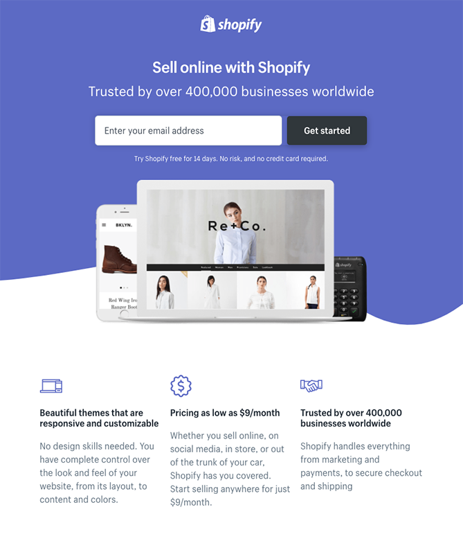
Shopify has the best eCommerce landing page examples, you should check it out. You see how they used images wisely, made use of the white space showcased only the essential content, that’s how you should design it.
Now, back to designing.
Most businesses get it wrong, they design their landing page to sell their products rather than designing a page based on their target audience.
So, the key to the high converting eCommerce landing page design is, knowing your target audience.
Perform buyer persona research to figure out who your target audience is, only then you can design a high-converting eCommerce landing page that can resonate with them effectively.
You need a captivating headline
Crafting a compelling headline is the next step in the eCommerce landing page best practices. A captivating headline is what will persuade the customer to stay on the page and it is a much needed eCommerce landing page optimization.
Headline increases the curiosity of customers to know more about the offer, imagine it as an identity/first impression.
If you can’t entice your visitors with your headline then you should brace yourselves for poor conversion rates.
Let’s make it simple, here are a few things a headline must achieve,
- It should be enticing enough to grab visitor’s attention.
- It must be easy to interpret and increase curiosity.
- Your headline must reveal what the page is about.
- Keep it short, not more than 20 words.
- The headline should resonate with visitor pain points.
- It should tease the offer, not give away everything.

This headline by Retainful stands as a testimony to the mentioned points. You see how it teases about recovering carts and increasing sales without giving away many details.
A visitor will know what the company is offering as soon as they land on this page, that’s how you should craft it.
A study shows that 7 out of 10 visitors quit the page if they are not impressed with the headline.
After all, it is the first thing visitors see on your page so it should be clear and concise. Still, If you find it difficult to craft the best headline you can always use the help of headline generator tools.
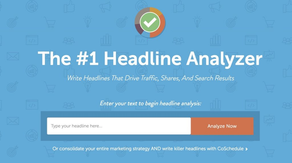
These tools can help you craft the best captivating headline for your landing page that can lure your visitors in and convert them into subscribers.
Visually enticing images
Adding images is one of the eCommerce landing page best practices, it will make the page visually pleasing, but you shouldn’t overcrowd your page with images.
Visitors are generally attracted to images and videos than text because our human brain processes image 60k times quicker than text.
If your content is too complex to be explained through text, then you can make use of images or videos to describe it.

Images are something to make a website look good than just placeholders. They play a crucial role in encouraging prospects and visitors to take the next step.
Follow these best practices for the eCommerce landing page images,
- The image should be large and attractive.
- Images should be related to the content of the landing page.
- In the case of a product landing page, using images of that particular product can be useful.
- If it is a service page, then the image should be visually enticing and relative to the visitor.
- Always use high-quality images, you can get royalty-free images from Unsplash.
Digital marketing experts say that landing pages with clear, crisp images have a better conversion rate compared to a text-based landing page.
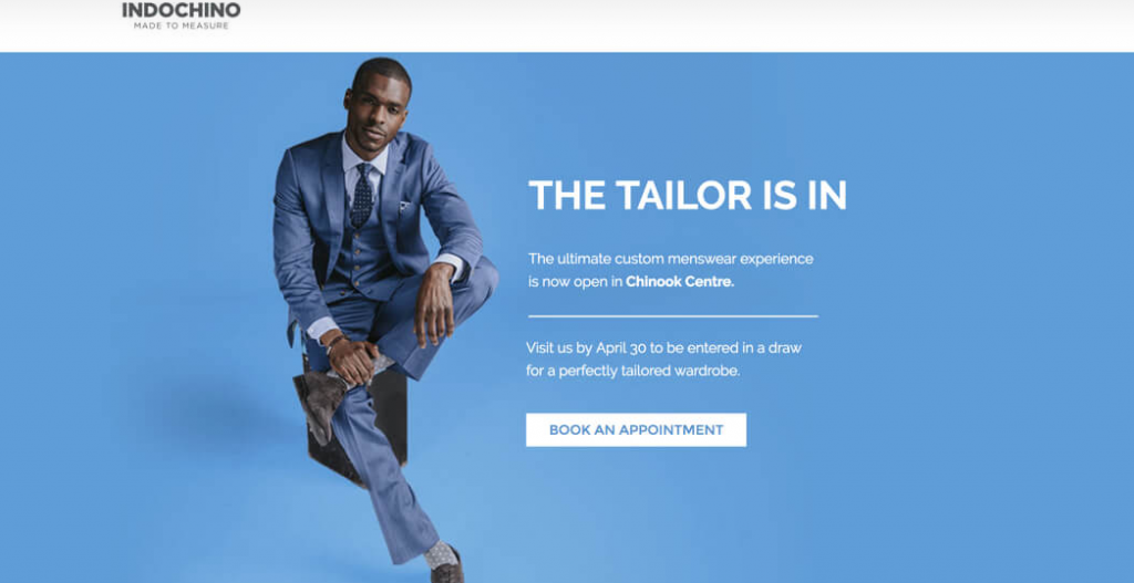
This is one of the best eCommerce landing page examples by Indochino,
- They didn’t overcrowd their page with images.
- Images resonate with the target audience.
But the most important thing about this landing page image is how they talk to the customer pain point. It simply says, ‘Are you having trouble with your suits, come here we’ll fix it for you.
We hope you understood the importance of images, just remember, ‘Images should reflect the feeling of your target audience and it should speak to their frustrations’.
Craft a persuasive content
Next in our eCommerce landing page tips comes the content. Now that you’ve grabbed your visitor’s attention with a captivating headline and image, let’s move to persuade them to perform an action.
You need a write a clear description of what you’re trying to offer on the landing page. Your content should be short and easily readable.
Easily readable?
Yes, if your target audience isn’t able to interpret what you’re trying to convey, it’s better to say goodbye to them.
Isn’t the headline enough to convey our message? Do we need to craft standalone content for the landing page?
In that case, you need to understand what you’re landing page is about.
Best eCommerce landing page example :
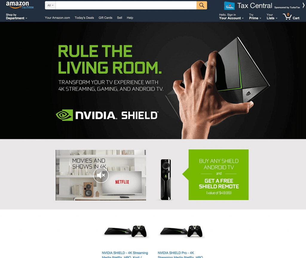
If it is about a simple product then a headline, an image, and a sub-headline would be feasible.
But if it is more of a service, then you need to be even more clear and descriptive to interpret your motive to your visitors.
These points will help you to write a better landing page content,
- Understand your customer pain points.
- Tell them about the solution(your product) for their pain points.
- Explain the features of your product and how it will work.
- Describe how your solution can improve their life.
- Show them the testimonials to prove you’re not faking.
One of the best eCommerce landing page tips is that you must not think of your content as a separate element rather think of it as an ultimate goal that you’re trying to achieve.
Add compelling Call to action
The Call-to-Action (CTA) is probably the most important element on your landing page, as it promotes conversion. Use an attractive color while designing the CTA button as it should stand out from other elements.
You can use CTAs to connect customers to your website, social media, sign up, or redirect them to your product or blog page.
Whatever its purpose, make sure you write a compelling verb to match the action like, shop now, read now, sign up, Get now, etc.
Best eCommerce landing page example :
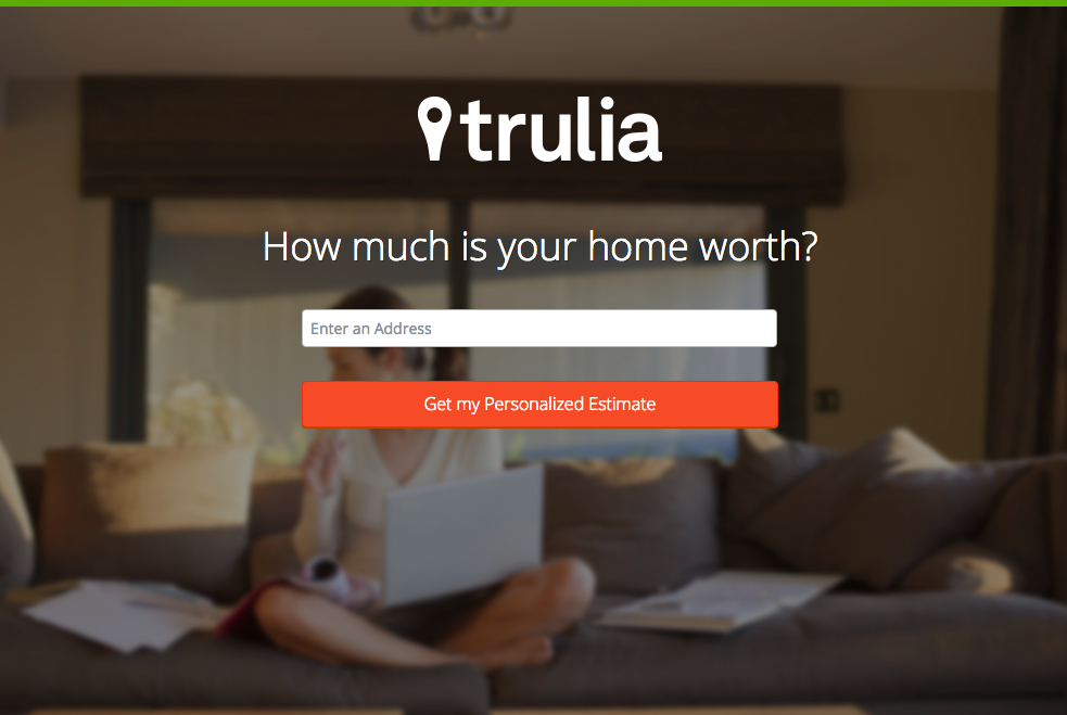
A recent study shows that having a CTA button rather than a link can boost your click-through rates by 28%. Here are a few eCommerce landing page ideas for CTA design,
- It must be action-oriented. Ex – Download now, subscribe now.
- CTAs must be clearly visible and legit(avoid broken links).
- Make sure CTAs are short less than 3 or 4 words.
- Your CTAs should be vibrant with contrasting colors.
- Concentrate your CTA copy on your visitor benefit.
- Provide necessary white spaces around the CTA.
- Place your CTA by perceiving where your visitor will look.
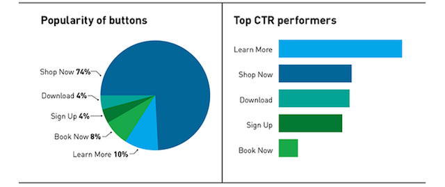
The above illustration will show you some of the best performing CTAs, choose the right CTA relative to your landing page to guide your visitors to the next step from the landing page.
Don’t miss out on potential revenue. Try Retainful’s easy-to-use e-commerce marketing tools and see results in no time!
Remove needless navigation
Your landing page has only one purpose: to transform visitors into leads.
Ecommerce businesses use the landing pages to encourage visitors to perform a specific action.
So, external links or navigation to other pages should be avoided on the landing page as it may confuse the visitor on his decision.
Removing other links or not including any will funnel the focus of the visitor entirely on the Call-to-action button.
It seems a bit confusing, isn’t it? We’ll show you the flow of a landing page so you’ll get the clear picture,
- Initiate with the headline.
- Explain the purpose of your page.
- Mention the feature and benefits.
- Showcase your testimonials.
- End with the CTA button.
Design your landing page in this flow to get the maximum conversions. Make sure you add all the elements in one page to avoid frustrations.
Spend more time in CTA placement, read your landing page with the flow and imagine where your customer’s eyes would be at the end, that’s where you should place the CTA.
Best eCommerce landing page example :

Let’s look at another best eCommerce landing page example by Spotify
They know where the customer will look after reading the headline, so they place the CTA at the bottom to end the purpose of the landing page.
Include simple and intuitive forms
Alright, we saw how to design a landing page for a product or services, what about a landing page for collecting information.
Most businesses use landing pages to collect visitor information or emails to build their buyer persona to identify the target audience.
These landing pages usually contain a web form of various fields where a visitor can fill out the information to subscribe or signup.
Best eCommerce landing page example :
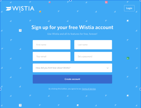
When it comes to web forms there is no specific rule on how many fields should the form include, the best eCommerce landing page tips is to keep it short. Ask only the necessary information to build the lead.
Mostly name and email are enough to do the job, the more you ask the less engagement you’ll get. So, the less you ask the higher your conversions.
Showcase your social proof and trust signals
A recent study shows that displaying customer testimonials and social proof on your landing page can effectively motivate your visitor to take a specific action.
Social proof is the volume of influence that your business has on Social media(Like, shares, subscribers, pins, etc). Displaying these is one of the eCommerce landing page best practices to boost your credibility.
Another form of Social proof is customer testimonials, you can also showcase them on your landing page.
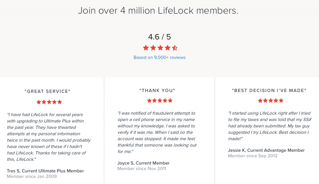
You know, customers always look at what others say about a product before purchasing them, so showcasing these testimonials on your page will nurture your engagement and boost your sales.
Including trust signals in your landing page will prove your authenticity, they are similar to social proof but these trust badges give you professional recognition and credibility.

Many studies have found that including trust signals is one of the eCommerce landing page best practices as it boosts conversions and sales.

Having these badges on your landing page will show how legitimate your page is and visitors will move forward with their activities without any hesitation.
Still not sure about the impact of trust badges? This study was done to find out how much people relied on trust badges.

This study shows that, simply because there were no trust badges, over 60 % of consumers did not buy. Because people will doubt the site’s security due to the absence of a trust badge.
Ecommerce landing page optimization
Nearly 30% of visitors access websites through mobile devices or tablets, if they are not able to see your landing page on these devices, you’re missing out on a huge opportunity.
If your landing page is not optimized for devices other than desktops, you’ll lose your sales and conversions, that’s why eCommerce landing page optimization is necessary.
Designing a landing page for your mobile devices can double your conversions as mobile sales have been skyrocketing in past years.
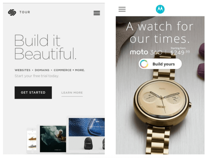
This is one of the best eCommerce landing page examples, look how they’ve placed CTA for easy accessibility.
Here are a few tips to remember while designing a mobile landing page,
- Use large fonts to avoid the need for zooming to read it.
- The landing page should have single-finger accessibility.
- CTA should be large and easily accessible.
- It should be fast loading.
If the eCommerce landing page optimization is done precisely, your visitors will get the opportunity to access and convert, whether they’re on a laptop, phone, tablet, or anything else.
Test, Test, and Test
The final process in the eCommerce landing page best practices in testing. Ecommerce landing page optimization cannot be done without an extensive amount of testing.
To see what your landing page does right and what it does wrong, testing and monitoring results are critical.
Split testing is crucial for eCommerce websites. Split testing or A/B testing is simply creating two variations of the same page and splitting the traffic to both the page and see which performs well.
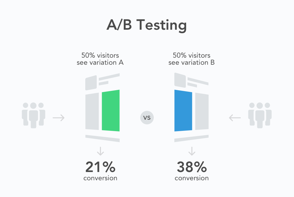
Usually, two variants are created, the original page and the challenger page where the challenger pages will be tested against the original page.
You can do this test manually but it is recommended to use software to carry out split testing. Here are some components you can test in your landing page,
- Headline
- Image & videos
- CTA color
- Click triggers
- Copy on the page
- Lead form length and fields
Testing these fields can help you achieve highly converting eCommerce landing pages. Start off with simple elements like color, headline, and then move to the complex elements.
Ready to take your e-commerce business to the next level? Retainful has got you covered. Sign up now for our powerful tools to drive sales, increase customer engagement, and grow your revenue
Wrapping up!
The landing page gives you the platform to convert your visitors into subscribers, it serves as the first impression so you should follow the eCommerce landing page best practices to build highly converting eCommerce landing pages.
We crafted this guide to show you some of the best eCommerce landing page examples, why you need landing page for eCommerce and eCommerce landing page ideas to increase your traffic and boost your conversions.
Frequently Asked Questions
A great ecommerce landing page is one that is designed to provide a seamless and engaging experience for potential customers. It should be visually appealing, with clear and concise messaging, a compelling call-to-action, and easy-to-use navigation. A great ecommerce landing page should provide all the necessary information about the product or service being offered, including pricing, features, and benefits, to help potential customers make an informed decision.
To create an ecommerce landing page, you should start by defining your target audience, highlighting the benefits of your products or services, and ensuring that the page is visually appealing and easy to navigate. Additionally, you should incorporate a clear call-to-action and optimize the page for search engines.
To create a perfect landing page, focus on a clear and compelling headline, a concise and persuasive message, eye-catching visuals, and a strong call to action. Additionally, make sure the page is optimized for mobile devices and regularly test and refine the page to improve its performance.
The critical elements that make an ecommerce landing page convert include a clear value proposition, high-quality product images and descriptions, customer reviews, trust signals, and a simplified checkout process.
The three important sections of a highly converting e-commerce page are the header section, the product section, and the call-to-action section. The header should have a clear value proposition and navigation, the product section should have high-quality images and descriptions, and the call-to-action section should have a persuasive and visible button.
The top 5 features that are a must for any e-commerce site are a secure and reliable payment gateway, responsive design for mobile devices, a user-friendly interface, robust search and filtering capabilities, and effective customer support. Additionally, incorporating social proof elements, such as customer reviews and ratings, can also boost the site’s credibility and trustworthiness.
