Ecommerce Checkout Process – It might not look that complex but it is the one that directly influences your online store sales.
Most store owners don’t care about eCommerce checkout initially, they start to notice it only when their sales are impacted due to the increase of Abandoned carts.
Yes, badly optimized eCommerce checkout leads to Cart abandonment.
It’s time you put an end to it and streamline your eCommerce checkout process by using some of the best eCommerce checkout practices discussed here.
Boost Customer Retention by guiding them using timely, automated, and personalized emails with Retainful.
What is a Checkout in Ecommerce?
The eCommerce checkout process is a series of steps that a customer has to take to complete an eCommerce purchase.
Let’s talk about the steps in an eCommerce checkout process,
- It initiates when the customer has made his purchase decision and clicks ‘Buy Now’ to purchase the product.
- Then the next step is the destination, where the customer has to enter his Shipping and Billing address.
- Next comes the crucial step where the customer has to select the mode of payment and different payment methods.
- Then the Grand finale where a customer has to place the order and thus the checkout triangle is complete.
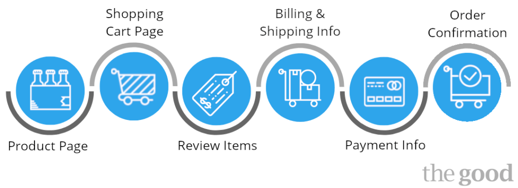
Looks pretty simple, isn’t it!
But not for all eCommerce store because
Ecommerce checkout is where you draw the line between a successful purchase and an abandoned cart.
If you have an optimized eCommerce checkout process then you’re on the safe side. If not, then you’ll have to deal with Abandoned carts which have impacted sales of many online stores.
Don’t worry, we’ll show you some of the best eCommerce checkout design practices to give you a heads up.
What is an eCommerce checkout cart abandonment?
An eCommerce checkout cart abandonment is when a customer initiates the checkout process but quits while its process is midway. There are many reasons that contribute to this which we’ve discussed below.
Is Cart abandonment and eCommerce checkout cart abandonment the same?
No, they are not the same, Cart abandonment is when a customer adds items to his cart and then abandons the cart right away.
Whereas checkout abandonment happens when the cart is abandoned during the checkout process.
Reasons for eCommerce checkout cart abandonment
Checkout abandonment is entirely different from cart abandonment because here the customer had the intent to purchase and that’s why he initiated the checkout process.
But then he decided to quit it, why? You need to do some thorough analysis to find out why it happened.
With the firepower we possess, we did some research and have listed the major reasons that lead to eCommerce checkout cart abandonment.
- High Shipping, delivery costs, etc.
- Mandatory account creation to purchase.
- Fishy payment gateway.
- Longs and exhausting eCommerce checkout.
- No offers, discounts, or coupon codes.
- Express Shipping is not available.
- No Refer a friend program to earn discounts
- Your website might have some internal issues.
- Your Shopify store’s return policy isn’t exciting.
- Limited payment options.
These are some of the major reasons for eCommerce checkout cart abandonment and we’ll show you how to overcome these issues with the best eCommerce checkout practices.
Rectifying eCommerce checkout cart abandonment
As you might’ve seen there are many reasons contributing to Ecommerce checkout cart abandonment, you have to devise multiple ways to improve it.
Here are a few tips for you to optimize your eCommerce checkout.
Avoid mandatory signup
This is the most common reason for checkout abandonment, the horror is that still many eCommerce stores are still practicing this.
Forcing customers into signing up is not the best way to achieve conversions. Besides, you’ll just frustrate them more and lose them forever.
So, what is the remedy for that?
Yes, surprise your customers with guest checkout. By doing this you can convert a visitor into a customer because of the speedy checkout process.
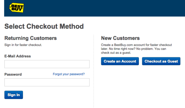
Having guest checkout and converting a visitor into a customer is better than dealing with an abandoned cart.
No additional costs
The reason a customer is midway into the eCommerce checkout process is that he was convinced with the price of the products and he has decided to buy.
Now he comes to the payment section and he sees the additional costs, most likely the shipping and delivery costs. And he’ll start thinking that he is not getting a better deal and he’ll abandon his cart.
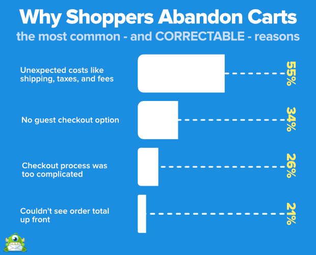
It might not look like a big deal, you might’ve calculated the shipping cost to pull off some more revenue, but guess what, now you have an abandoned cart in your store.
You can clearly see how much these additional costs impact cart abandonment, so here’s what you do.
- Allow Free shipping in your store.
- Simmer down on your delivery rates.
Trust Signals
This is a digital world we live in, everything has gone digital even the transactions but for older generations who are trying to fit in with new technologies, they expect some proof to trust your store.
Not just the older generations even the millennials have raised their voices about data security.
So, as a merchant how will you prove that your store is secure and it can be trusted?
You showcase your Trust badges or Certificates!
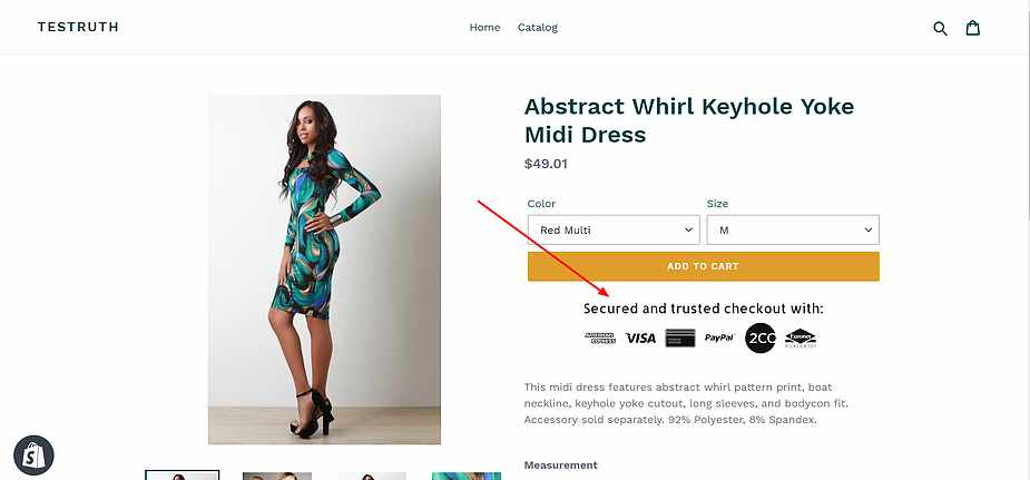
There are many trust badges that are available for eCommerce stores but a handful of them can really boost your conversions by lowering your eCommerce checkout abandonment.
Showcasing them in your best eCommerce checkout process will foster trust among your customers and increase your customer retention rates.
You can also make use of customer reviews and testimonials because customers trust other customers better than a store owner.
Multiple options for Payments
So, a customer has decided to purchase because he thinks he’s getting a better deal. Now he has to pay, here are some scenarios on how it’ll go.
- The customer has got hot cash, so he wants to ‘Pay on Delivery’
- The customer has a credit or debit card so he decides to pay online.
- The customer decides to pay on installment.
Now, how will you know the customer’s position? The answer is you don’t.
That’s why having a single mode of payment doesn’t work in eCommerce stores that too in this digital era. It is not a perfect eCommerce checkout optimization.
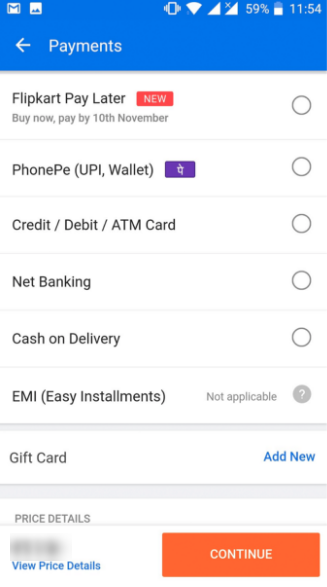
Having multiple payment options will ease out the shopping experience of the customer and prevent a customer from abandoning the cart.
Ecommerce stores are rising at every corner, so to keep yourself on the top this is one of the best eCommerce checkout practices you need to employ in your online store.
Shorten the checkout
One of the major contributions to eCommerce checkout cart abandonment is the eCommerce checkout process itself.
The longer and exhausting eCommerce checkout process can frustrate the customer so they abandon their cart and move to a store that has a the best eCommerce checkout process.
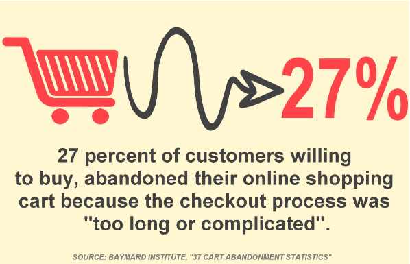
Usually, the eCommerce checkout process takes 6 steps to complete,
Cart > Billing info > Shipping info > Shipping method > Order preview > Payment
What we are suggesting is bring down your eCommerce checkout optimization process to 3 steps as it is one of the best eCommerce checkout practices.
Shopping Cart > Billing & Shipping info > Payment
We experimented with this cart checkout best practices and it has given us some great results. Here are some more tips to reduce checkout time.
- Number of fields to fill can be reduced
- Options for Autofill
- For members and subscribers, enable express checkouts.
- Showcase trust badges to ensure secure payment
Use of Popups
Yes, popups are a great way to prevent customers from abandoning their carts during the checkout process.
There are two types of popups that you can use to prevent eCommerce checkout cart abandonment.
- Add to Cart Popup
- Exit-intent popup
Add to cart popup is a website popup that is displayed when the customers click the ‘Add to Cart’ button.
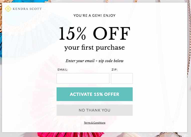
You can offer some exciting deals and motivate them to purchase the products to make use of that deal as this is one of the cart checkout best practices.
Not only do you prevent them from abandoning their cart, but you also grab their emails using Add to cart popup for further communication.
Next comes the Exit intent popup, now this is a trigger-based popup.
Exit-intent popups are triggered when the customers move their cursor towards the exit or clicks on the exit button.
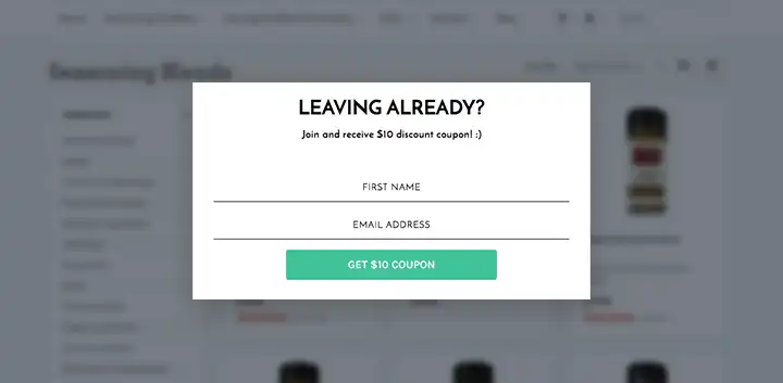
Offer them with exclusive deals to persuade them into purchasing a product instead of abandoning their carts.
Plugins like Retainful is a one-stop solution for all your cart abandonment problems. It follows the best eCommerce checkout practices to improve your conversion rates.
Optimize to speed up your website
We know how it hurts when a customer comes all the way to checkout and then abandon his cart.
So, the best eCommerce checkout practices are to speed up your website. A recent study says that the average waiting time of any customers is 2s.
Yes, just 2s, within that you’re store should load if you want customers to continue shopping at your store.
Here are a few things you must check to speed up your website,
- Reduce the size of your images but don’t sacrifice quality.
- Don’t overcrowd your store with plugins.
- Avoid having broken links on your website.
- Combine and reduce the files that have coding.
- Allow files to be stored in the cache.
- Optimize it for all the devices.
These are some of the best ways to speed up your website, make sure your loading time is under 2s.
Persuade customers with offers and discounts
There is no one in this digital world that would say no to sweet discount offers on a product.
As a matter of fact, customers might have abandoned their carts at checkout due to the lack of discounts.
To be honest, customers expect sweet deals, so the cart checkout best practices is you’ve got to give it to them.

You can offer them discounts like,
- Percentage discount
- Flat discount
You might think offering discounts in your store might be a tedious process but there are many discount plugins that can do the work for you.
A great thing about discounts is that you can promote them and expose your store to new customers. Here are a few ways to promote it.
- Promote it on your homepage
- Send discounts in your cart recovery emails
- Display discounts on your product and cart page.
These can help you build brand awareness of your online store.
We have now seen how you can prevent eCommerce checkout abandonment. But what happens once the cart has been abandoned.
Well, that’s where email marketing comes into play.
How to recover abandoned carts through email marketing?
Sometimes even after taking all the precautions, there will be many abandoned carts that might’ve escaped your grasp.
Now, what will you do? Will you try to win them back or acquire new customers?
If you think, acquiring new customers, then you’re in a lot of trouble. Acquiring new customers will cost you a fortune, you’ve already lost many sales due to abandoned carts.
So, the best thing is to win them back. Recover your abandoned carts and convert them into sales.
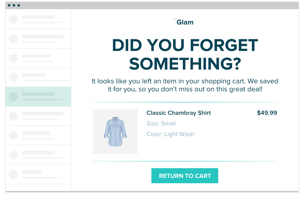
Because it is one of the cost effective ways to generate new leads and retain existing ones and also it is the best medium to initiate a Cart recovery campaign.
Cart recovery campaign
Cart recovery campaign is the act of sending email reminders to customers who abandoned their cart and requesting them to return to the store and complete their purchase.
Why should we send cart recovery emails?
Because customers might have forgotten that they left a cart in a store so it is a simple reminder to trigger their senses.
Retainful is a Cart recovery app that can send a series of emails to customers at a specific sequence until he recovers it.

Retainful is automated, so all you have to do is specify the time sequence and let the plugin do the work for you.
Here is the recommended time sequence,
- 1st email – 1 to 4 hours after abandonment – Just remind them of their cart.
- 2nd email – 24 hours after abandonment – Showcase your customer testimonials.
- 3rd email – 3 days to 7 days – Persuade them with an offer and make them return.
So, now you’ll know how to recover your carts after getting abandoned at the eCommerce checkout.
But there are some cart checkout best practices you must follow in your cart recovery campaign or you’ll lose your customers forever.
Best Cart recovery email practices
- Act immediately
Don’t wait for the next day, if you see an abandoned cart in your store you initiate your email campaign right away. Because emails sent within 1 hour of abandonment have a better conversion rate.
- Segment the user base
If you are dealing with cart recovery for the first time, it is recommended that you split your user base in order to check various approaches. This saves time and is going to help you pick the right solution.
- Concentrate on guest-users too
Guest users must never be ignored because they too hold back more revenue just like users with accounts. It is also a chance to grow the email list.
- Don’t force it
Yes, most store owners push their customers, they send cart recovery emails like some sort of an order and force them to recover it. The more you create the friction the more you lose.
- Think out of the box
Conventional ways of thinking sometimes hit a roadblock. Dare to be different to stand out from the crowd. Break the rules and go out of the way to reach out to your customer base.
Retain customers effortlessly. Make your customers feel valued and appreciated with Retainful.
Best practices for perfect eCommerce checkout page design
If you want to minimize your eCommerce checkout abandonment, then you should have the best eCommerce checkout design.
UI/UX is crucial for eCommerce stores, if you don’t follow the checkout page best practices to design the page, you’ll face a lot of issues.
Checkout page design can be split into two,
- Single-Page Checkout
- Multi page Checkout
Single Page checkout
Single page checkout as the name suggests is a design where all the eCommerce checkout process is bought into a single page.
The form fields are less, it has a fewer clicks and all the basic components like billing, payments are all under one roof.
Multi page checkout
Multi page checkout is a design where the eCommerce checkout process is split into multiple pages to increase the user-experience.
It is a long detailed process when compared to a single page checkout, with forms for each page which has to be complete to proceed to the next page. It is most suited for mobile devices.
Single page checkout vs Multi page checkout
| Single Page | Multi Page |
| All components are on a single page, so it takes fewer clicks | Structured process so it makes the customers feel secure. |
| It looks simple as it only takes one page to complete it | Each page is designed to make the user-experience smoother |
| It saves time and attracts more customers | Minimal content for every page, so faster loading times |
| Prolonged scrolling can frustrate customers | Multiple pages so it consumes more time |
| Due to packed content the site can be slow. | Rolling Back to alter information is not possible. |
| You cannot analyze customer behavior. | Might irritate customers and cause them to abandon the cart. |
| Suitable for Desktops and Tablets | Best suited for Mobile phones. |
These are some of the pros and cons of the two crucial page designs. The choice is upto the merchant, make sure you perform A/B test and select the best eCommerce checkout design.
Optimizing eCommerce checkout page for Mobile devices
Alright, we’ve the best eCommerce checkout designs but since mobile users dominate the eCommerce stores, let’s talk about eCommerce checkout optimization for mobiles.
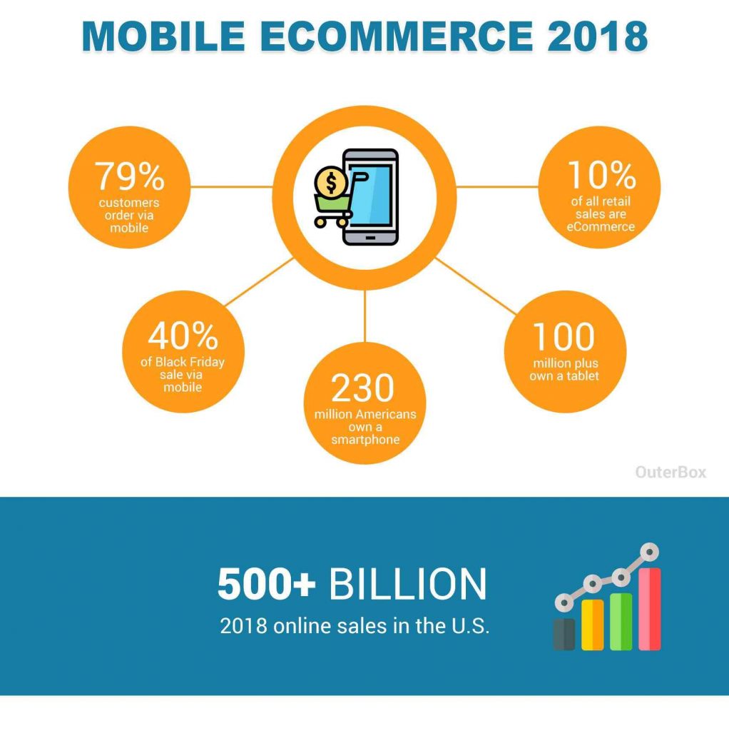
Our world is running on mobile phones, a recent study pointed out that around 79% of people access eCommerce stores through mobiles.
So, when you’re designing your checkout page you should consider the optimal experience for all the devices, but most importantly smartphones.
Let’s discuss the best practices for mobile eCommerce checkout design.
Rule of the Thumb
Thumb is the key to how we use our mobile phones, a recent study showed that 49% of people hold their smartphones with all their fingers and leave their thumbs free to interact with the mobile.
Even when you hold your mobile with both your hands, your thumb is the one that interacts with the device, it is the dominant finger.
Keeping this in mind, this is how your eCommerce page should be designed, so that every part of the page and the buttons can be accessed by your thumbs.
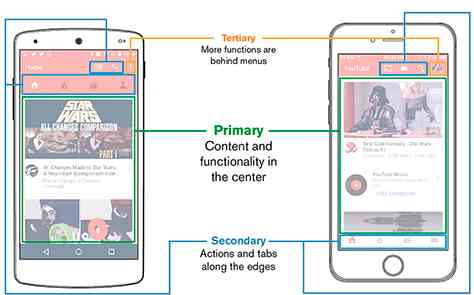
When you design your mobile eCommerce checkout page like this you can have a maximum conversion as it satisfies the thumb rule and increases the UX of the page.
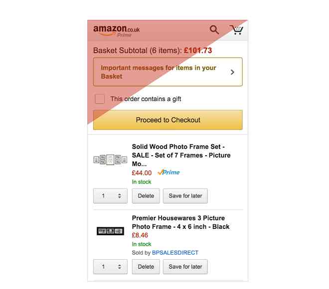
Here is how the mobile checkout page of Amazon looks like, you can see the most crucial buttons of the page are in the easily accessible area of the thumb.
Avoid long eCommerce checkout process in mobile design
Even Though single checkout pages have their pros, using them for mobile devices is not a good eCommerce checkout optimization process.
Users might get easily frustrated while scrolling down through all the forms, that’s why you need to use page breaks.
Instead of bringing the entire checkout process in one page, you can break the checkout pages into 3.
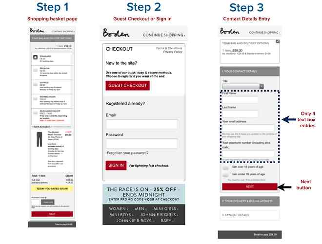
Divide your checkout process into 3 pages with the button ‘Next’ at the bottom of each page to show the progress.
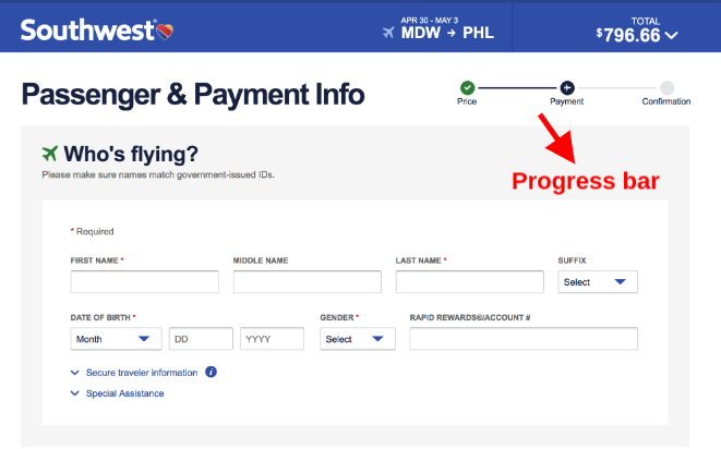
You can also include a Progress bar at the top of the bar to show the customers that they are in the right path during the checkout.
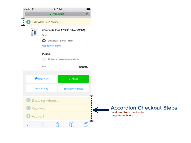
You can also use Accordions to show the progress to customers by collapsing the pages.
Accordions are an outstanding resource in the mobile design inventory, as they compress typically long forms and allow users to get a bird’s eye view of the whole form.
Text forms and CTAs
Text forms are the most important component of eCommerce checkout optimization. You need to make your text form user-friendly so as to not frustrate your users with too much data.
When you’re designing your text forms and labels here are a few tips to follow,
- Stack up your form one below the other with label on top
- Don’t use two text fields in a same row
- Use * to indicate the mandatory fields
- Use the same fonts
- Ensure the Autofill option is available.
- Revealing passwords to make sure they are typing the right one.
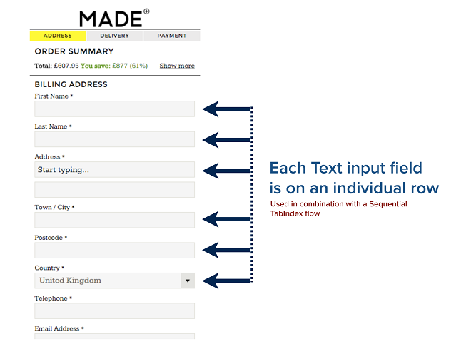
This will ensure a smoother transition of the eCommerce checkout process. Next are the buttons that make the decisions.
CTA buttons are the most important component of a checkout page; they are the answers to a process.
So as per the thumb rule, CTAs should be in a well accessible area and most importantly it should stand out from the forms with a distinct color.
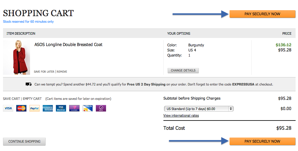
Having an attractive CTA button makes it enticing to press it and increase the user experience of the site.
Best eCommerce checkout software for 2024
Now that we’ve seen the eCommerce checkout page best practices, let’s list out some of the best software that can make your checkout page more user-friendly.
One-Click Checkout

One-click checkout is the right checkout software for your store, if you don’t want to make your customers wait. You can instantly increase your conversion rates by reducing the speed of your checkout process using One-click checkout.
Interesting aspect of this plugin is that it directly sends customers to the checkout as soon as they click Add to Cart.
WooCommerce Direct checkout

WooCommerce Direct checkout by Quadlayers is one of those plugins that you cannot miss having in your online store. If you want to reduce your checkout time and get customers directed to the checkout page instantly then this is the right plugin for you.
With this Direct checkout plugin, you can reduce the form fields and increase the user friendliness of the checkout process.
WooCommerce One-page checkout
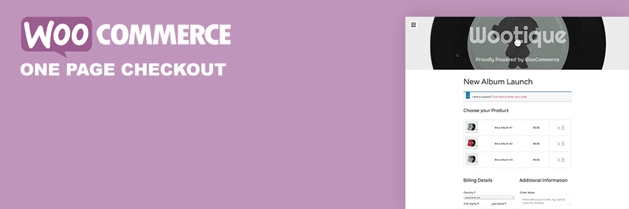
WooCommerce one-page checkout is the right plugin you need if you’re designing a checkout page for desktops. It is capable of squeezing all the necessary details, form fields into a single page thus helping the customers from jumping to multiple pages to finish the checkout process.
Checkout Field editor

Do you want to collect more information from your customers? Are you wishing to change the order of the text fields? The Checkout field editor is the right plugin for you, most merchants think that editing text fields are tedious but with this plugin, you can edit them in minutes.
Script Editor
Script editor is the newest wizard into the eCommerce checkout design world designed by Shopify themselves. It allows you to personalize your checkout page using line item, payment and shipping scripts so you can tailor your user experience to customers.
Best Checkout page examples
Many stores follow some of the best eCommerce checkout page practices to design the best checkout pages.
Here are a few examples,
- Tommy Hilfiger
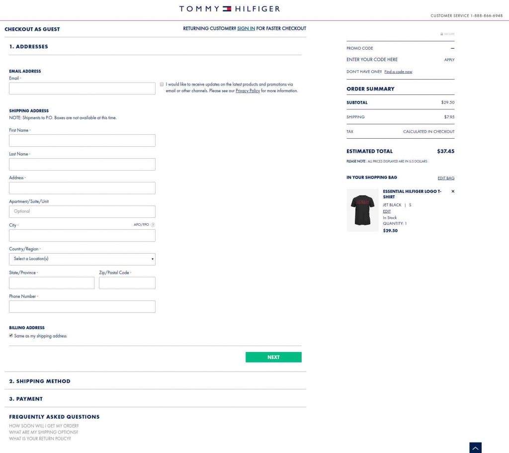
Tommy Hilfiger, one of the iconic fashion brands, is following the one-page checkout design for their desktop layout. It is the best eCommerce checkout process, with colors highlighting every Accordion. The highlight is the ‘Faster checkout for returning customers’ option at the top.
- Nike
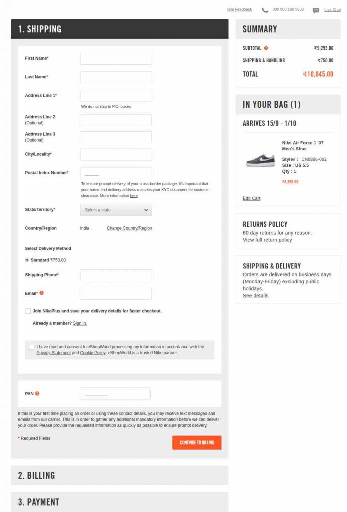
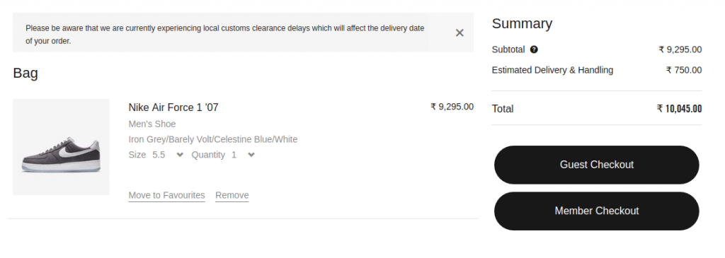
Nike, the Fashion Mogul, also follows a single-page checkout with collapsing Accordions. Their progress buttons are enticing and the most crucial thing that caught our eyes is the ‘Guest Checkout’ or ‘Member Checkout’ option before the Checkout page.
- AliExpress
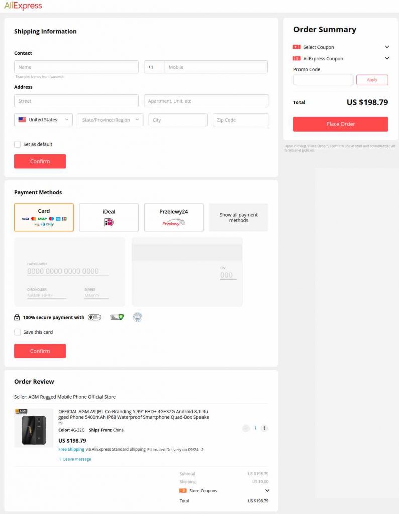
AliExpress, the pioneer in the eCommerce business has a multi-page checkout process. But the text fields are minimal, payments look really solid. But one thing that got us a little bit frustrated was the lack of Guest checkout which is not a good eCommerce checkout optimization process.
- Sony
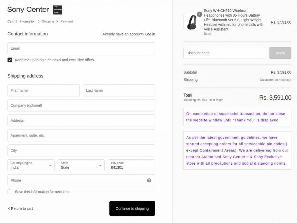
Sony, we don’t need an introduction for them, looks like their eCommerce checkout has the classic multi-page process. It has a very big and enticing CTA button, notice how it looks so basic with minimal text fields, loves it. The progress indicator in the top left is Top notch.
Increase customer retention by sending highly customized emails that engage customers with Retainful.
Conclusion
The ecommerce checkout process has to be optimized well if you want to minimize checkout cart abandonment. The best eCommerce checkout practices we discussed will help you build the best eCommerce checkout process and help you achieve better conversion rates.

